Woke
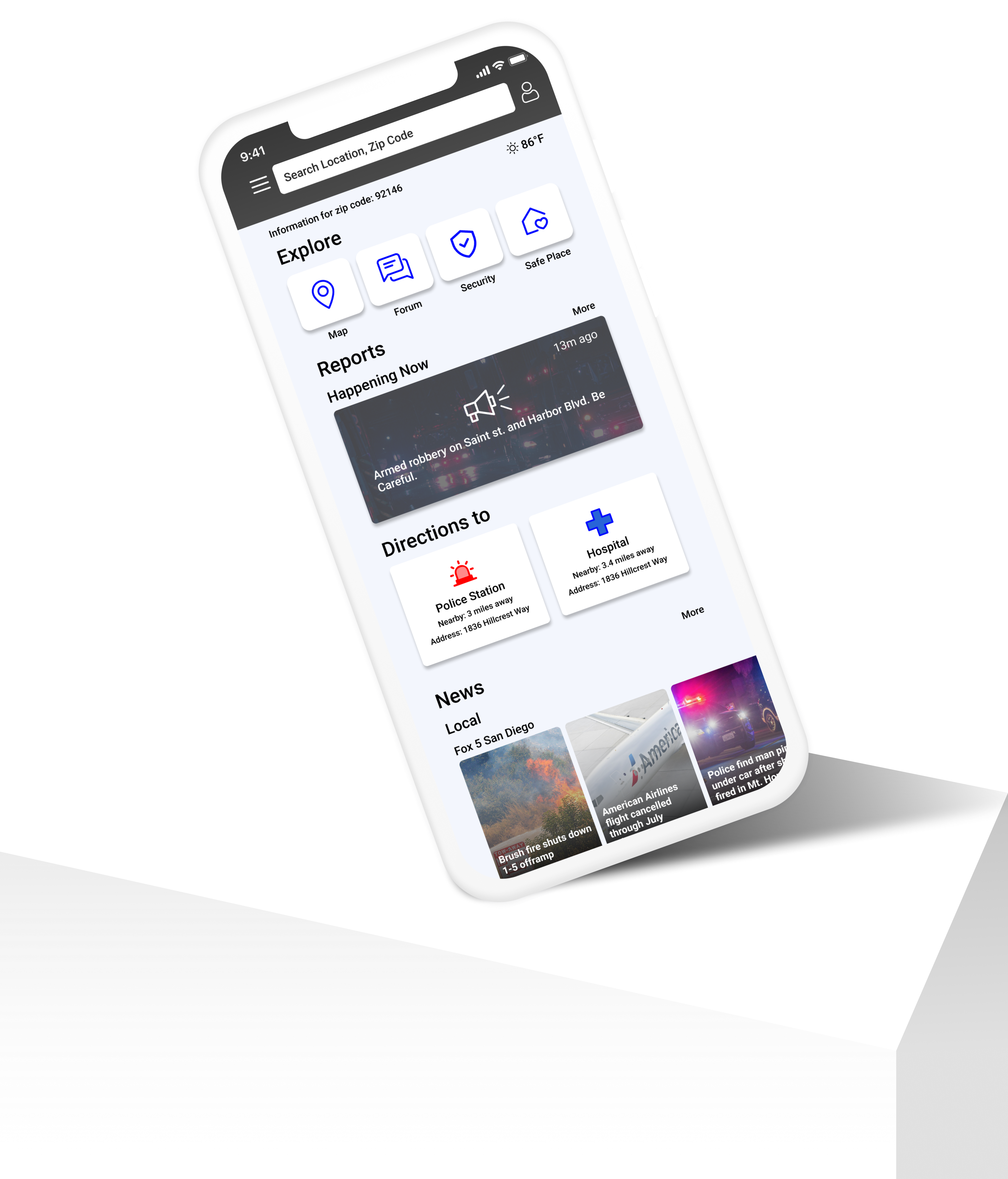
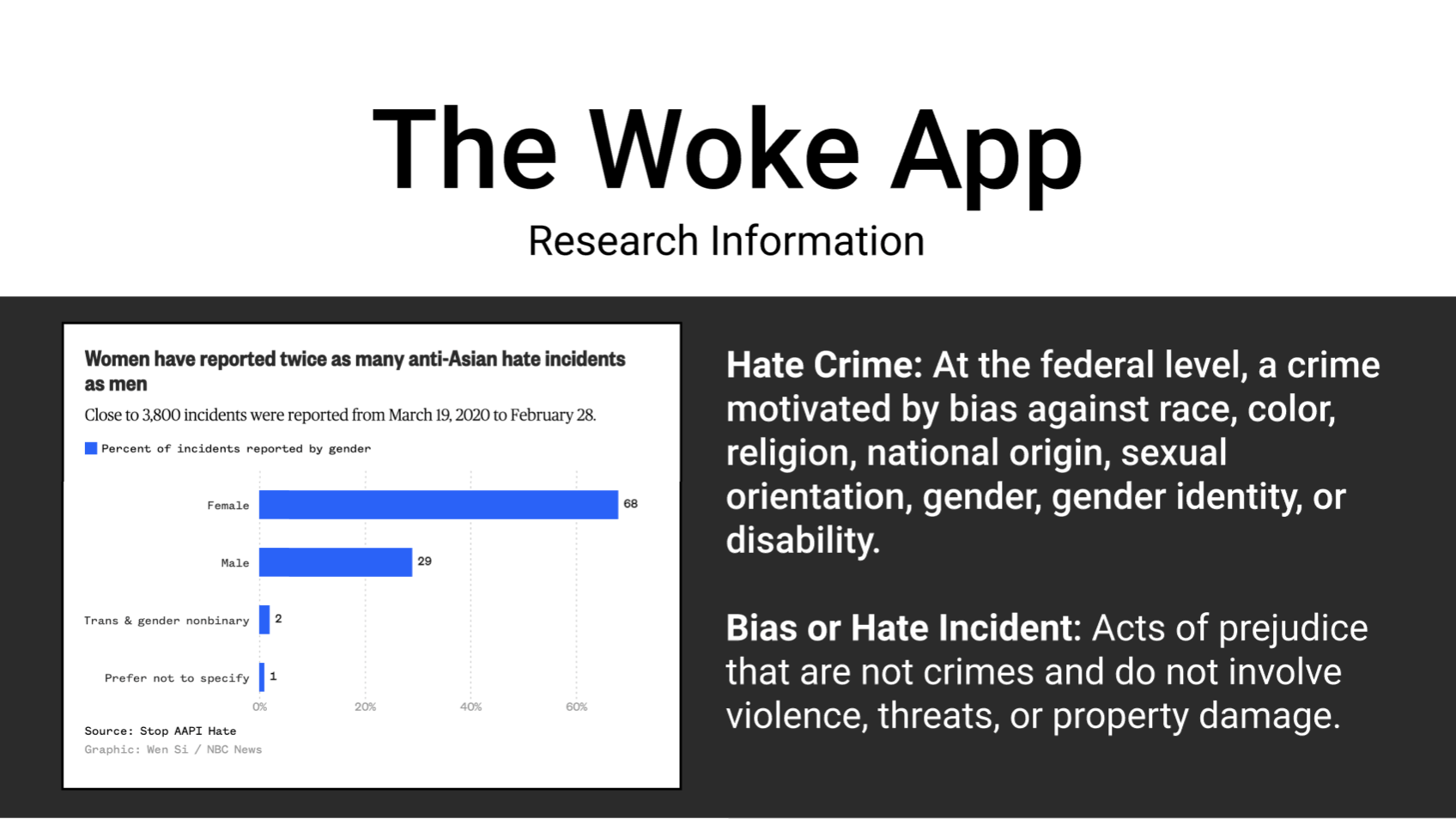
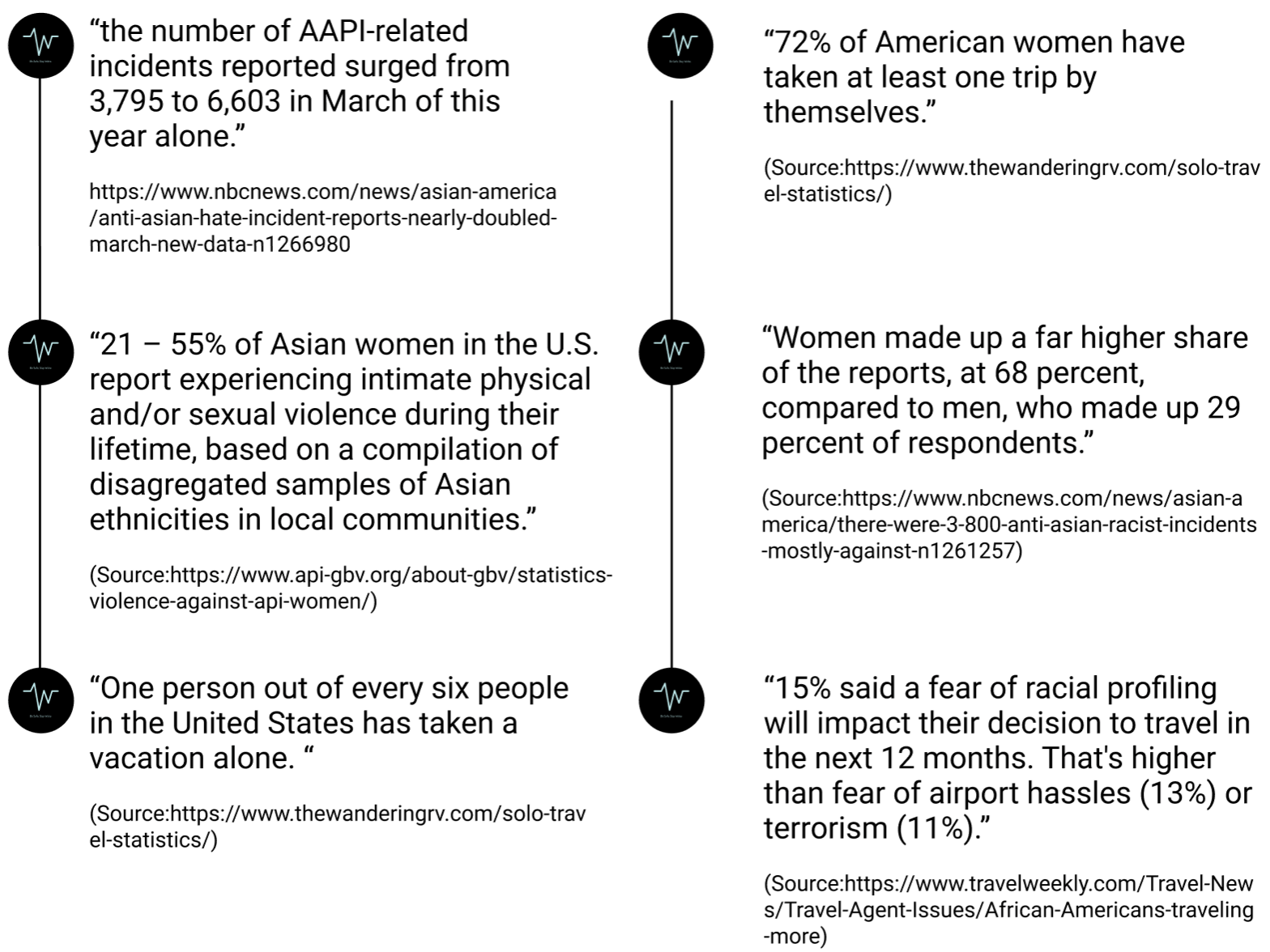
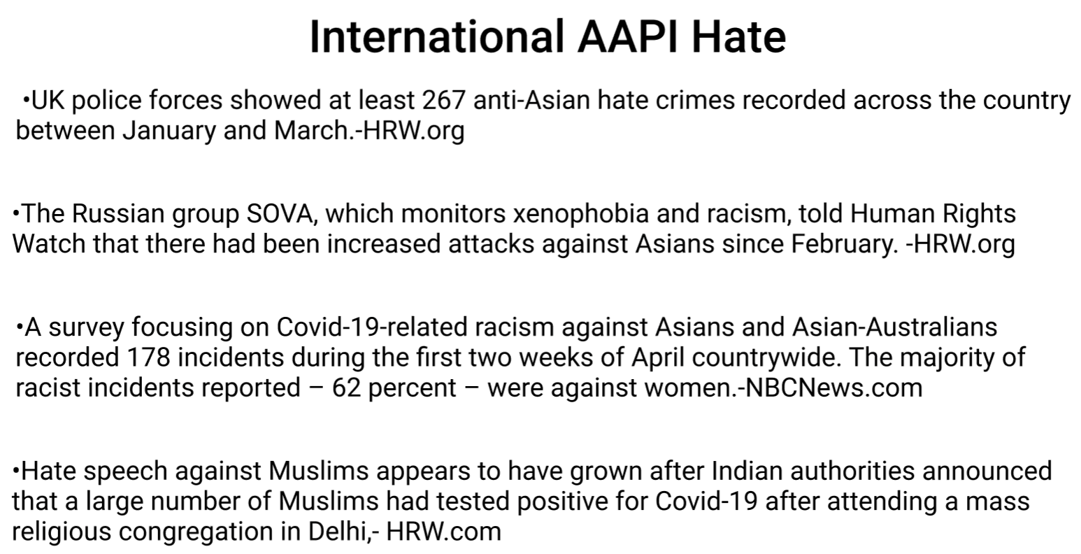
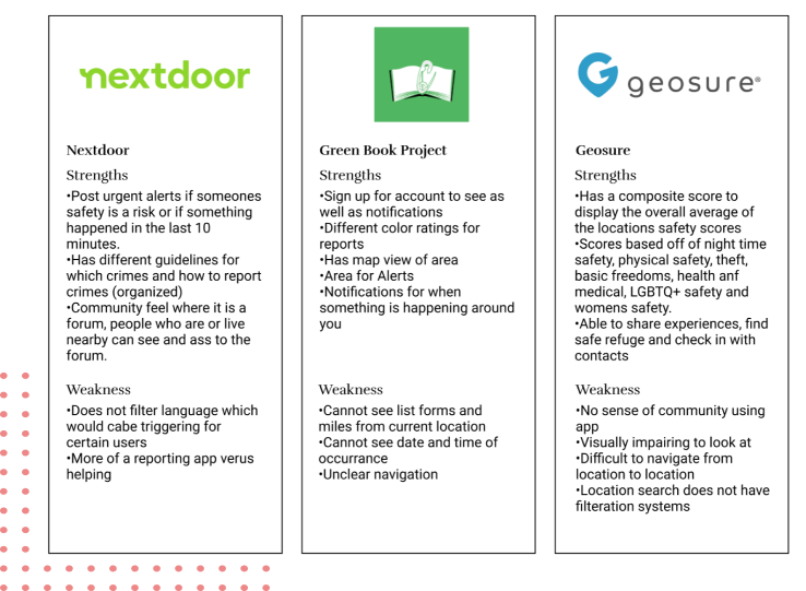
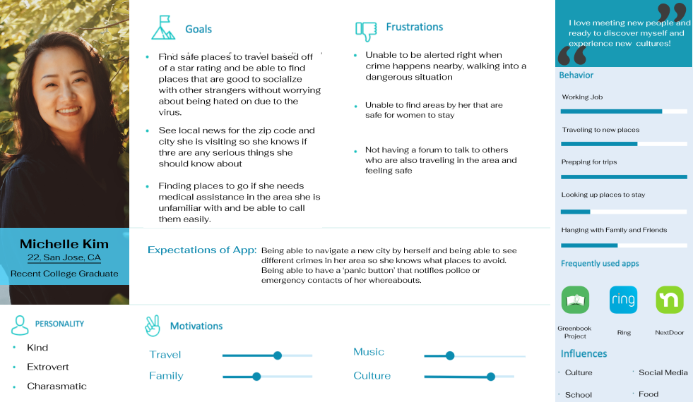
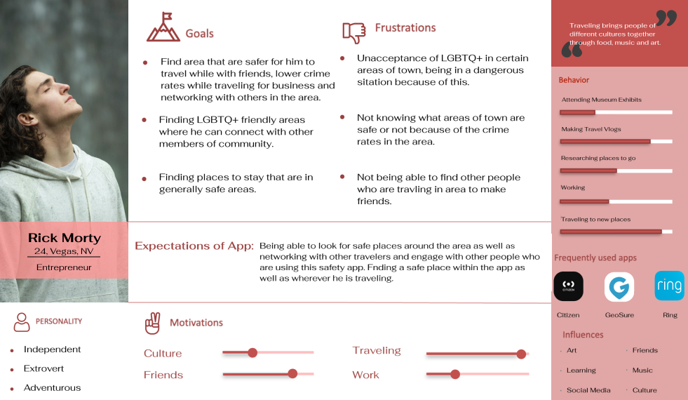
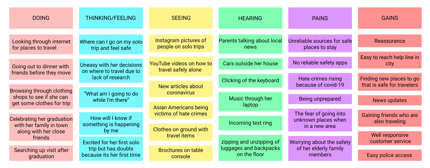
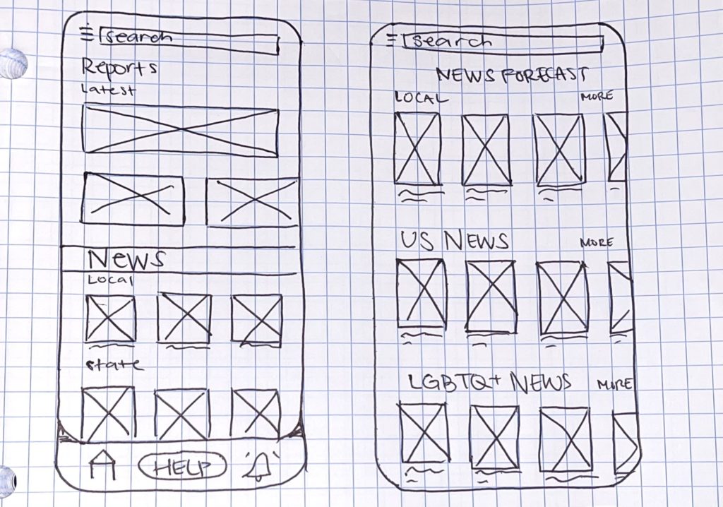
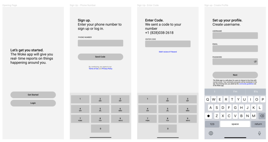
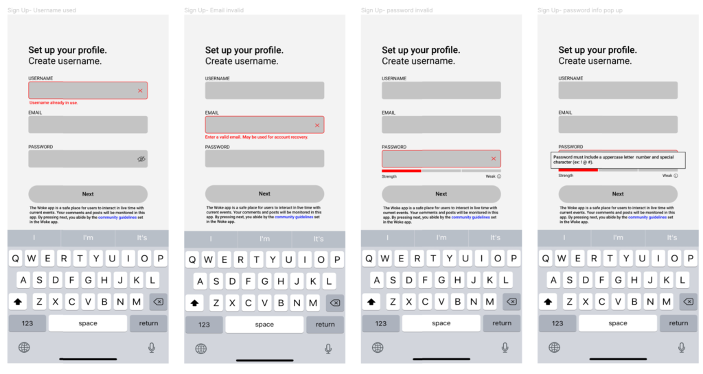
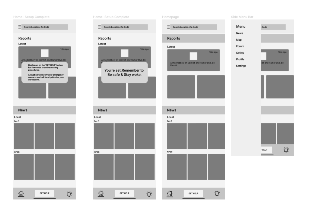
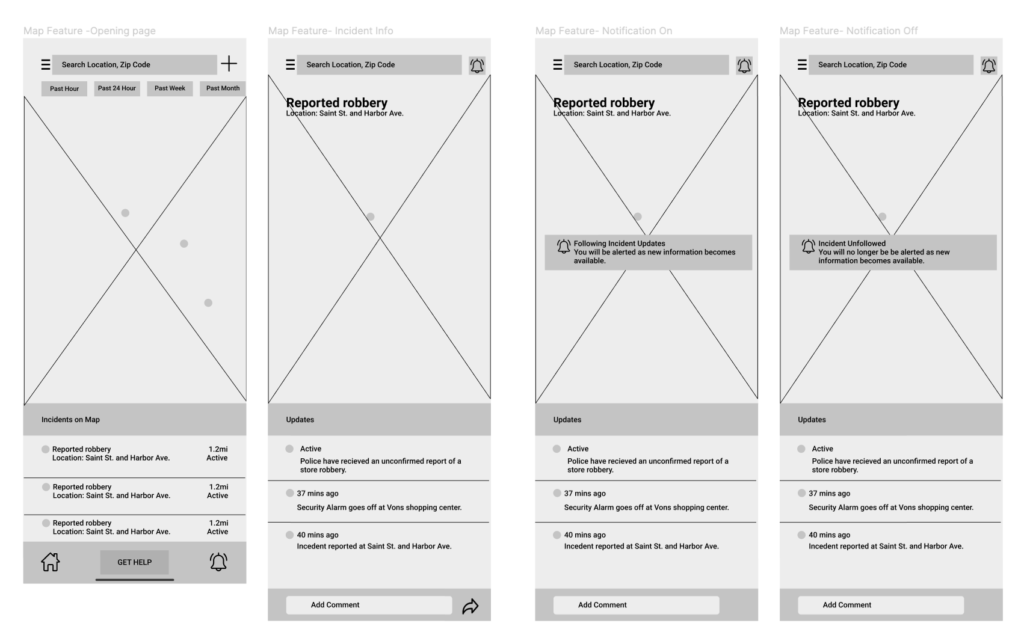
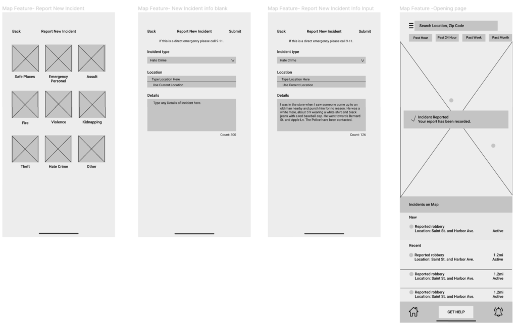
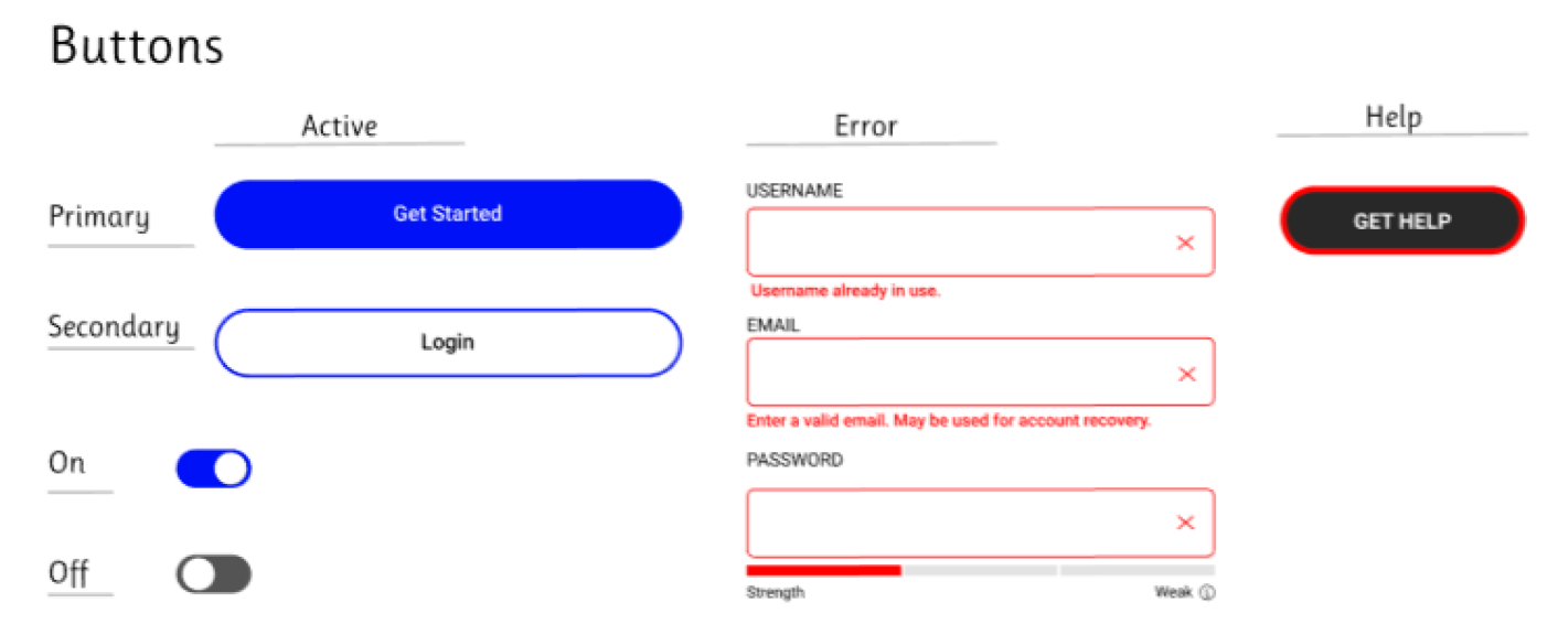
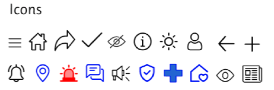
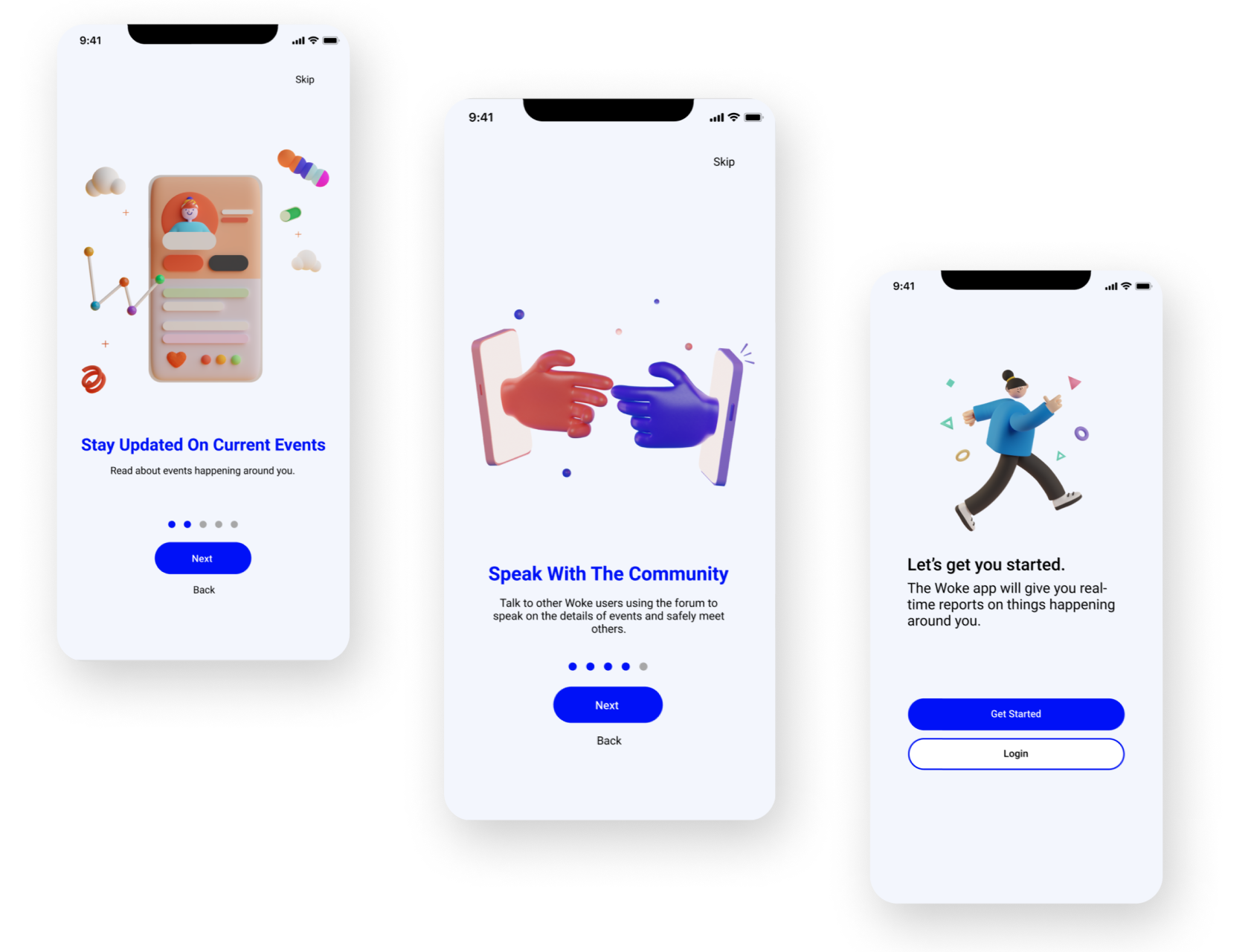
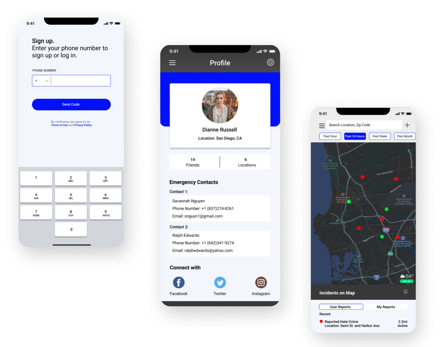
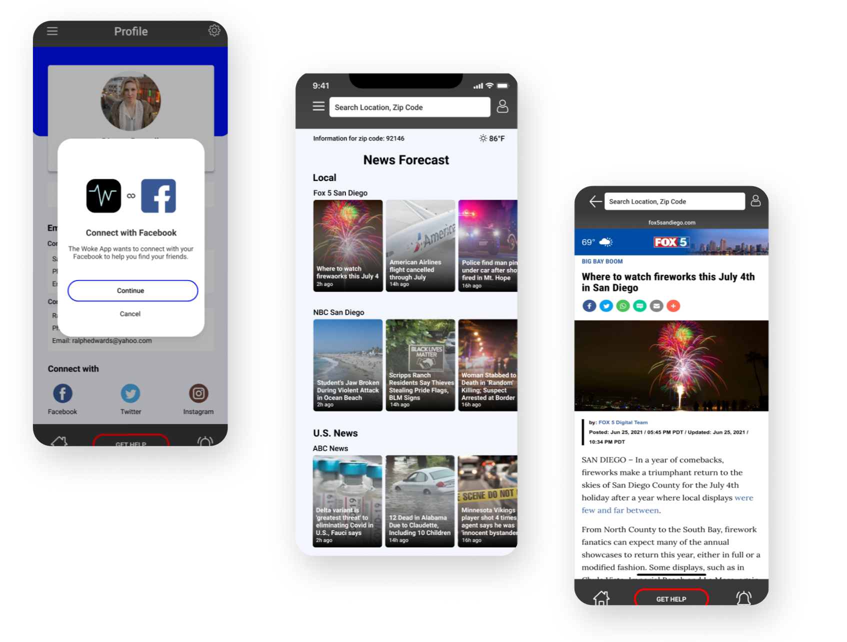
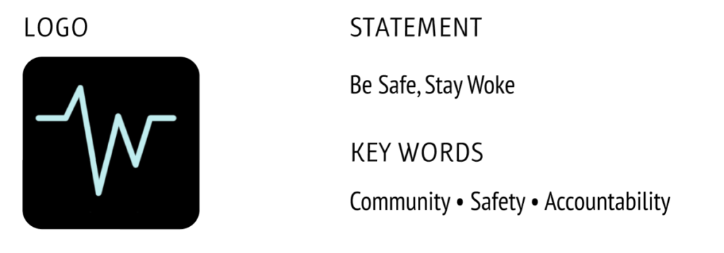
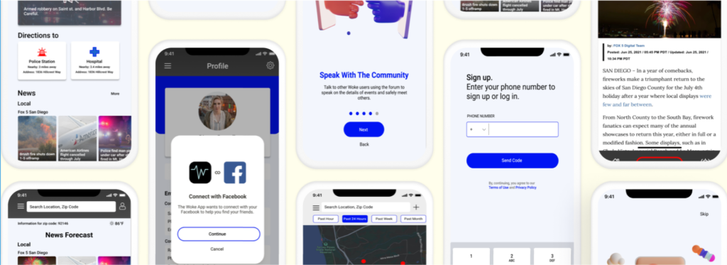
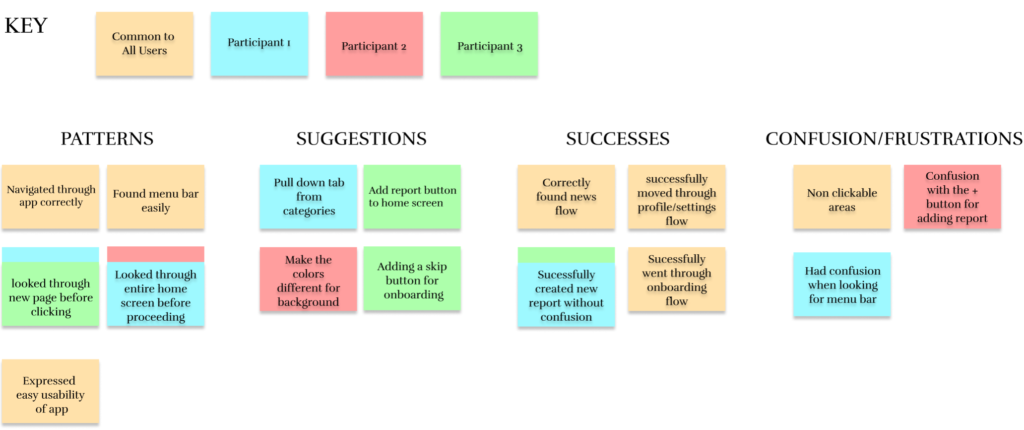
Woke is a new way for travelers to have safety reassurance when traveling. Members of the LGBTQ+ community, AAPI people, as well as women, travel safely in nearby areas by tracking violent, sexual, and hate crimes in their area. With the increase in cases for Covid-19, the Woke App strives to keep users in “the know” of rises in cases as well as violence, any place and any time at the touch of their fingers.

Project Overview
Challenge
Travelers have to do a lot of research through the web to find safe reliable areas to travel, and often are clueless about current events happening in the area they are residing. Lack of access to television and difficulty finding latest news cause vacation-goers to potentially be in danger without knowing. There is no automated help and safety travel apps in the market with multi featured approaches.
Role
UX Designer. User research, concept design, wire-framing, branding, UX design, UI design, usability testing and creating responsive designs.
Timeline
4 weeks
Task
Creating an end to end application with different features
Tools
Figma, Slack, Zoom, Safari, Figjam, Discord
The Design Process

Research
Goals
•Identify user motivations when searching for safe places to travel
•Identify frustrations and confusion with current travel safety applications in the market
•Understand user needs and goals in travel safety apps
Market Research
To better understand the pain points and frustrations of traveling users, market research was done to identify rising problems happening around the world. This helped us understand what important information is needed while traveling in areas of the unknown as well as understanding real-world events that are occurring in society today.


Competitive Analysis
Through competitive research, we were able to see the different market trends through various competing apps that are currently on the market right now. We were able to identify pain points and user error through this apps as well as identify key features and components that would be necessary in our own application. Noting the strengths and weaknesses, we were able to learn from these user experiences through our own personal user testing of these competing apps.

User Interviews
After conducting six user interviews with participants between the ages of 18 and 26 who were avid travelers and members of either the asian or LGBTQ+ community I was able to get better insight on their feelings towards traveling and apps for travel on the market today. After understanding their age and demographics, we asked questions to help understand what frustrations came with current safety apps on the market, as well as what users enjoyed. We also asked questions for how to help alleviate their travel anxiety.
Motivations
•The ability to see different occurrences of crime in their mile radius
•Finding places to stay that are safe (safe ratings)
•Meeting others who may be traveling alone
•Staying up to date with the current news in places visited
•Traveling to new places with different cultures
Frustrations
•Lack of information on tourist sites
•Finding safe areas when booking places to stay
•Having to use different platforms to find if an area is safe or not
•Looking for different resources and not being able to find them
•Not having updated crime alerts
The Design Process

Define
Personas
Meet Michelle and Rick!


Empathy Map
We created a way to really bring our persona to life and be able to strategize the different emotions they may be feelings in their day to day life. We created one for Michelle Kim to easily understand some of her pain points she mat be experiencing when she is planning on going on a trip.


The Design Process

Ideating Solutions
Primary Task Flow
After understanding the frustrations and motivations of the users, we put together a task flow to further empathize with our personas we created. We did so to be able to really understand the steps the user has to go through to find something in app like a safe house or the nearest fire department. This helps us minimize excess scrolling and clicking throughout the app.

Sitemap
In order to better consolidate the features for the app as well as organize them accordingly, the sitemap was created and used to help plan for the different elements needed in app as well as be able to lay out some of the overlapping features that could be morphed into one strong feature. This also allowed us to understand which features we wanted to build out for the sake of time and finances for this project.

Sketches
After doing research we and understanding different market designs as well as the different features and elements wanted in the app, we began sketching our wireframes in order to rule out the different options of sketches as well as jotting down new ideas before moving them digitally to Figma.


Grey-Scale Wireframes
After sketching different ideas for layouts that would best enhance our user experience as well as minimizing user learning, we began to create low fidelity wireframes to lay out the different components of each screen. While doing so, we kept in mind the common design patterns seen in traveling apps in the market right now and keeping in mind the personas that were created earlier in research.


Style Tile
After understanding the different brand messages and meaning, we created the brand style guide to formulate a trusted, modern and fresh look. This was integrated into the grey scale wireframes accordingly.


UI Design
While creating the high fidelity wireframes, feedback from mentors and colleagues were given to help improve the usability of this app as well as the UI. After much experimentation in the different options, the final high fidelity version of the app was completed. Due to lack of funds and time, we were only able to build out a few key features for this case study.


UI Kit
The UI kit was used to map out the different attributes to the Woke app. This helped keep a consistent guideline to use throughout the design.


Prototype
After creating the high-fidelity wireframes designed in Figma, the Figma prototype tool was used to build a hi-fidelity, limited functionality prototype for usability testing in order to observe how users interact with the site and identify where different improvements could be made.
The Design Process

Testing The Design
User Testing
After creating the high fidelity wireframes we put our designs through user testing in order to understand any complications seen in the design through the users understanding. The participant walked through their thought process of how to use the app through different directed prompts in order to see any user error and frustration while using the prototype. This also helped track the different habits of the participants while going through the app which helps us better tweak the design for the next version.
Affinity Map
