Booper is a community-focused startup with the goal of making being kind simpler. The Booper app is launching this March on both iOS and Android to help dogs and dog owners discover dog parks, connect with friends, and plan playdates We market our brand and services by investing in our community and engaging the public with community-building events.
*This project was through an internship with Booper Co., please contact me to see full prototype
Challenge Booper app needs new features for user turnover time, creating features that will increase user experience and screen time on the app.
Role
UX Designer. User research, concept design, wire-framing, branding, UX design, UI design, usability testing and creating responsive designs.
Timeline
8 weeks
Task
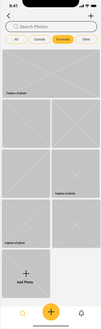
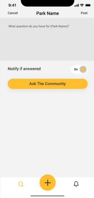
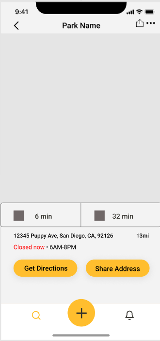
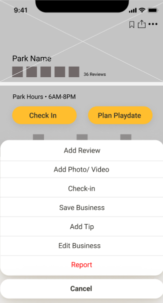
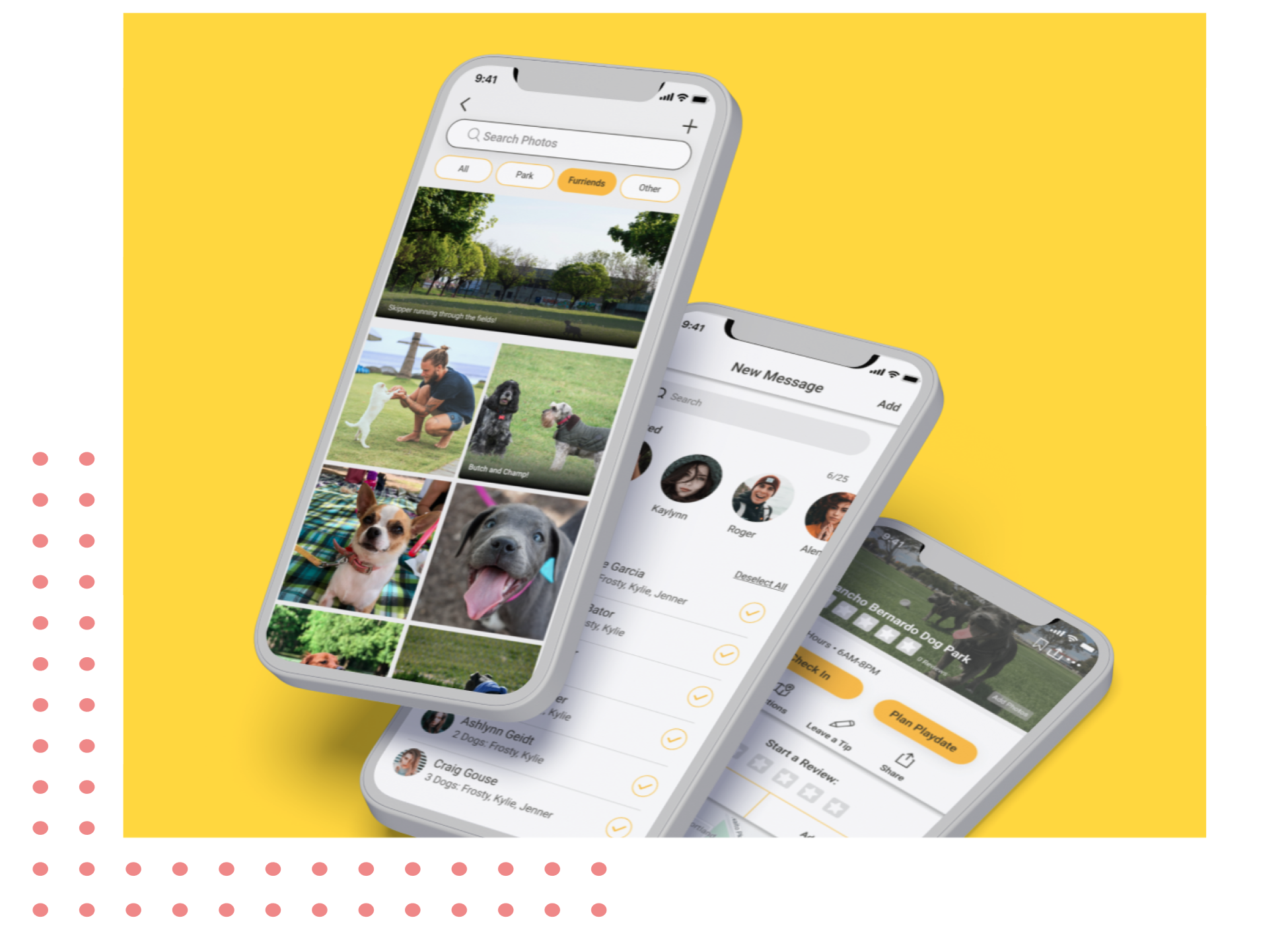
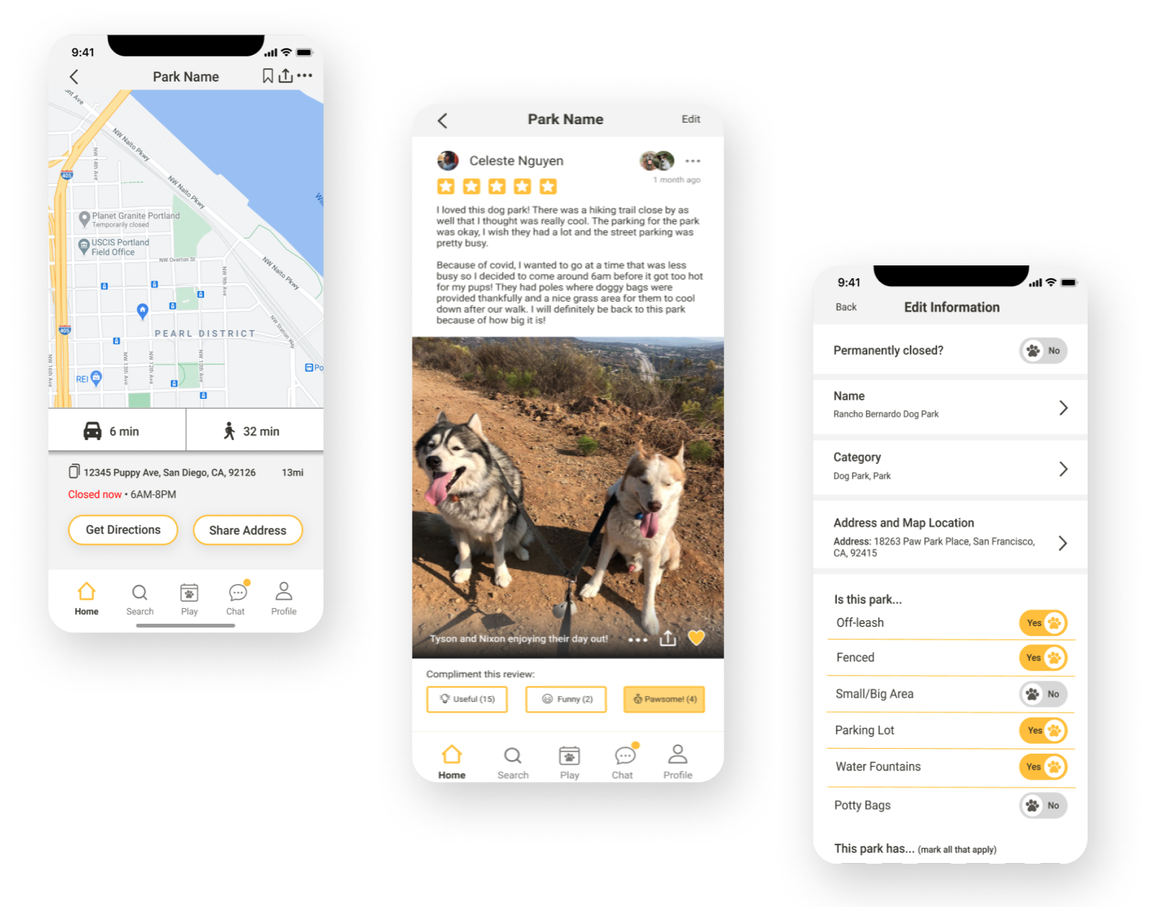
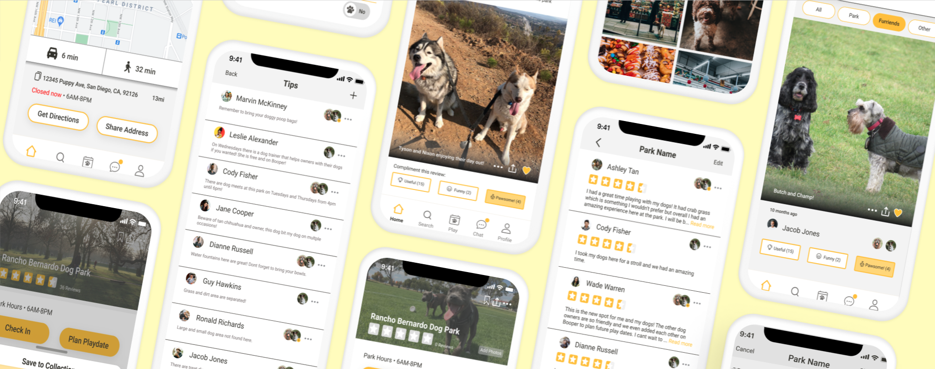
Creating a location (parks, bussinesses, etc.) for the existing Booper app.
Tools
Figma, Slack, Zoom, Safari, Figjam, Discord
The Design Process
Research
Goals •Identify user motivations with location profiles •Identify app frustrations and confusion when using location profile features •Identity user habits and needs for visiting the Booper app
Competitive Analysis
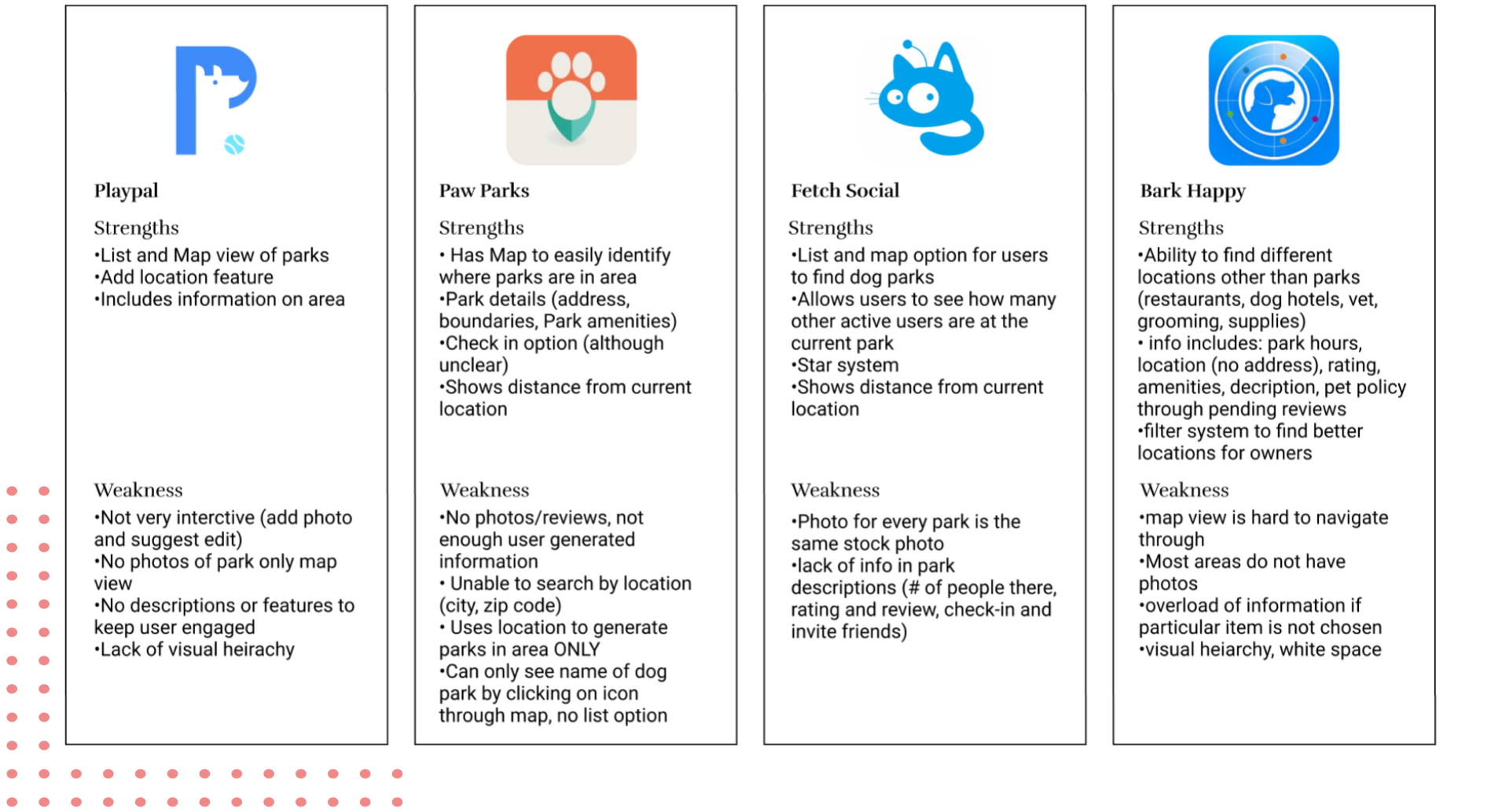
To start, we conducted competitive analysis to understand the existing features and designs implemented into the market currently. With this we were able to pinpoint some of the weakness’ and strength’s of each application to understand the needs and missing features needed in the current market. This also gave us understanding of common design trends seen in dog social applications.
User Interviews
Through conducting user interview with 10 participants between the ages of 20 and 35, all whom were social dog owners, we were able to get a better gauge of what was needed for the application as well as understanding user frustrations and paint points. Asking questions about location features seen in other applications were asked as well as information dog owners would like to see about parks and businesses were thoroughly discussed.
Motivations
•Finding highly rated dog parks and businesses •Finding other dog owners and friends •Planning dog dates with others •Looking for information about dog parks and businesses •Social aspects and exercise
Frustrations
•Lack of information •Unable to find other dog owners in area for play dates •What types of dog parks they are (leashed/unleashed/ big and small dog separation, type of flooring) •No website links, chat or appointment creation options
The Design Process
Define
Empathy Map
To understand our target users more, the empathy map helped us understand a normal day-to0day thoughts and actions of a user who is currently using Booper. We also were able to understand their pains they have with the current market as well as what they would like from it as well.
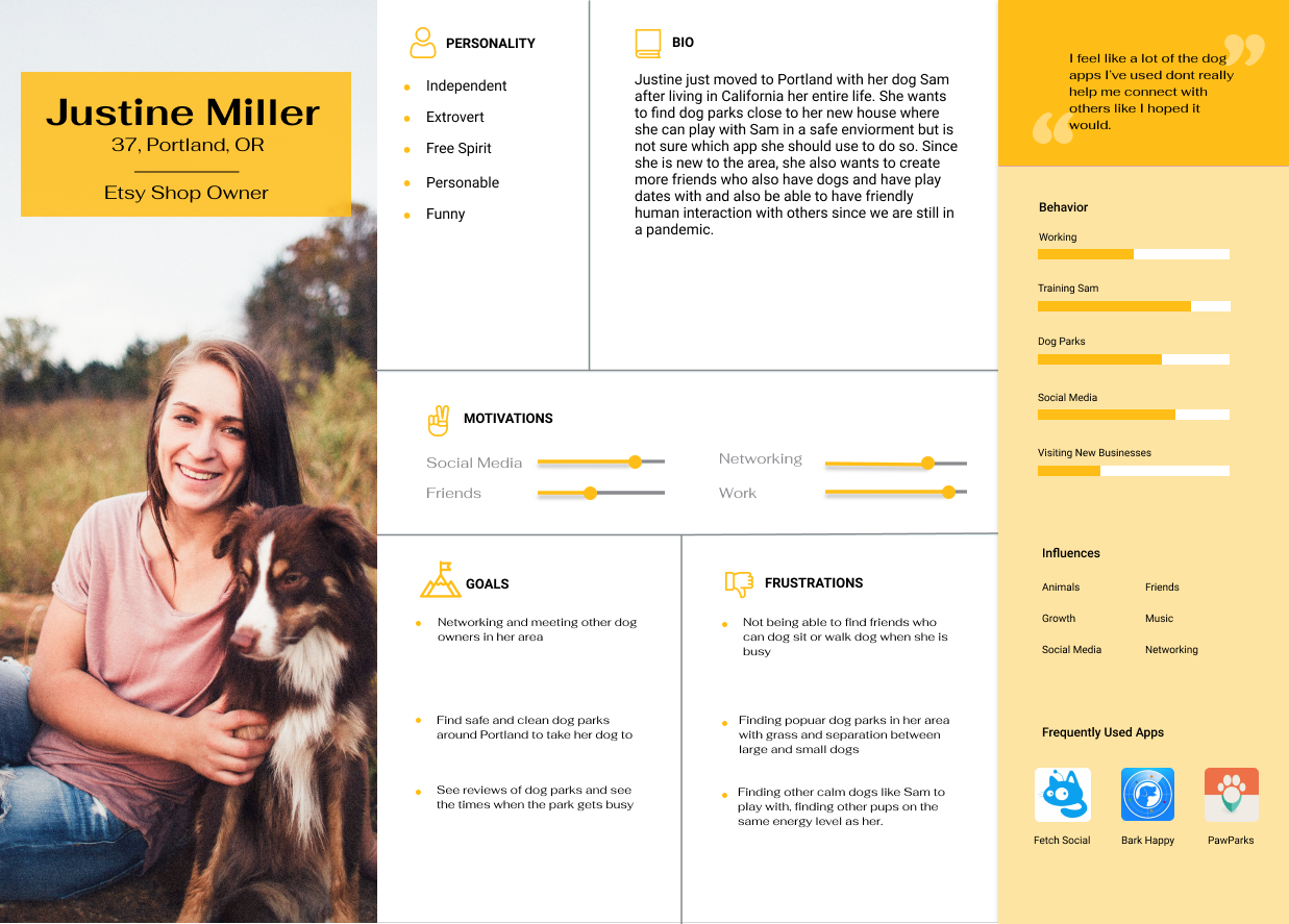
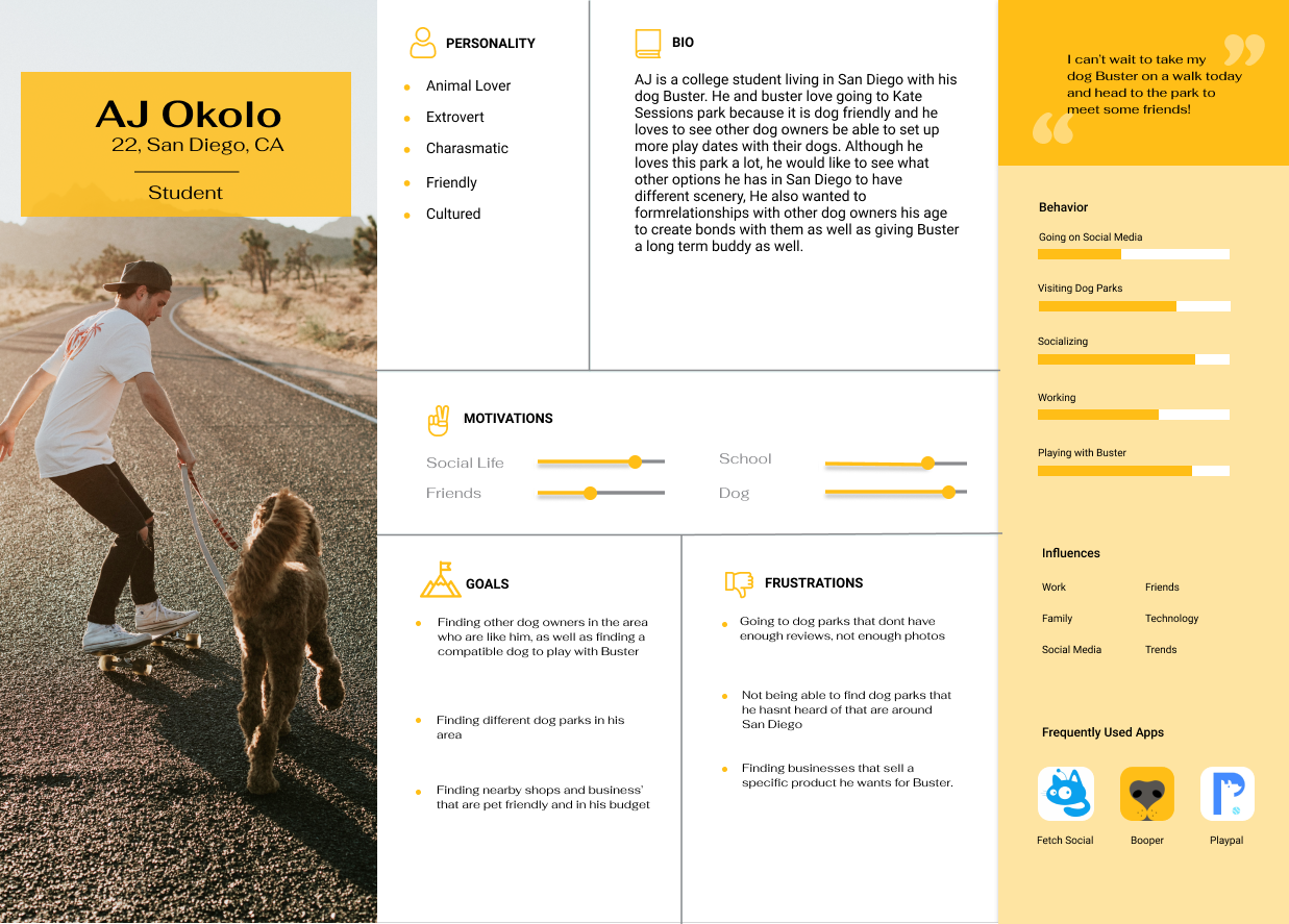
Persona
Meet Justine and AJ!
After understanding the users needs, habits and frustrations, we wanted to bring this user to life through a persona in order to keep this targeted user in mind while designing. We charted these dog lovers personality traits, frustrations and motivations to be able to consolidate their everyday life and emotions.
The Design Process
Ideating Solutions
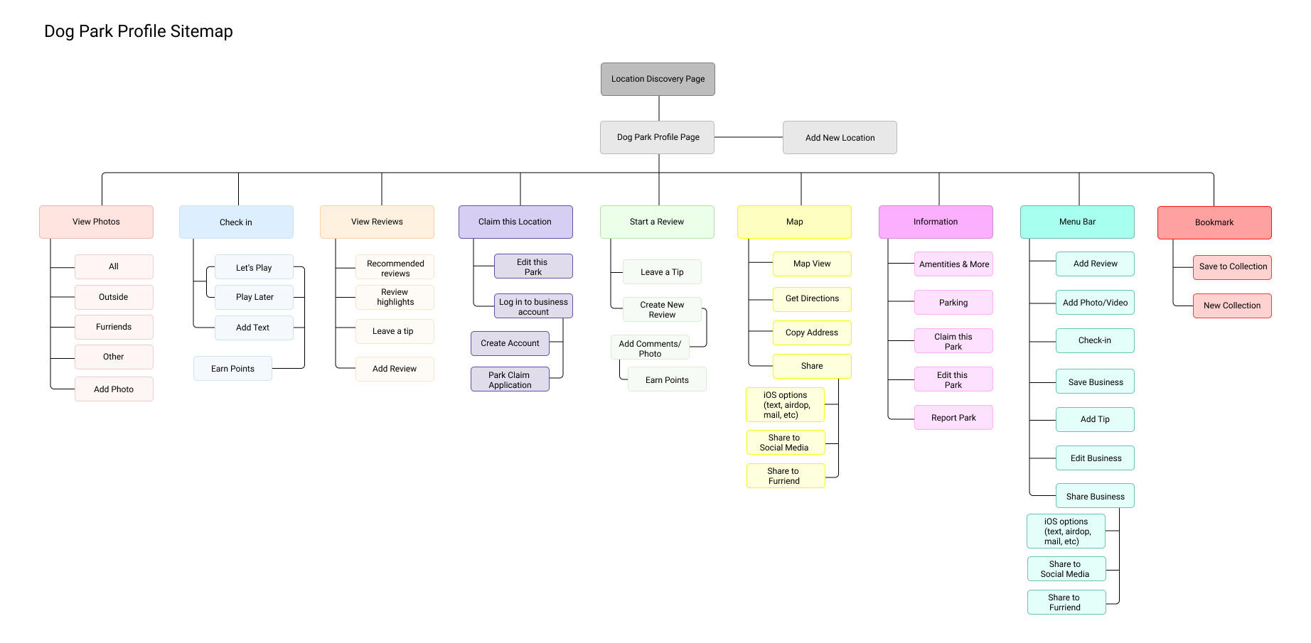
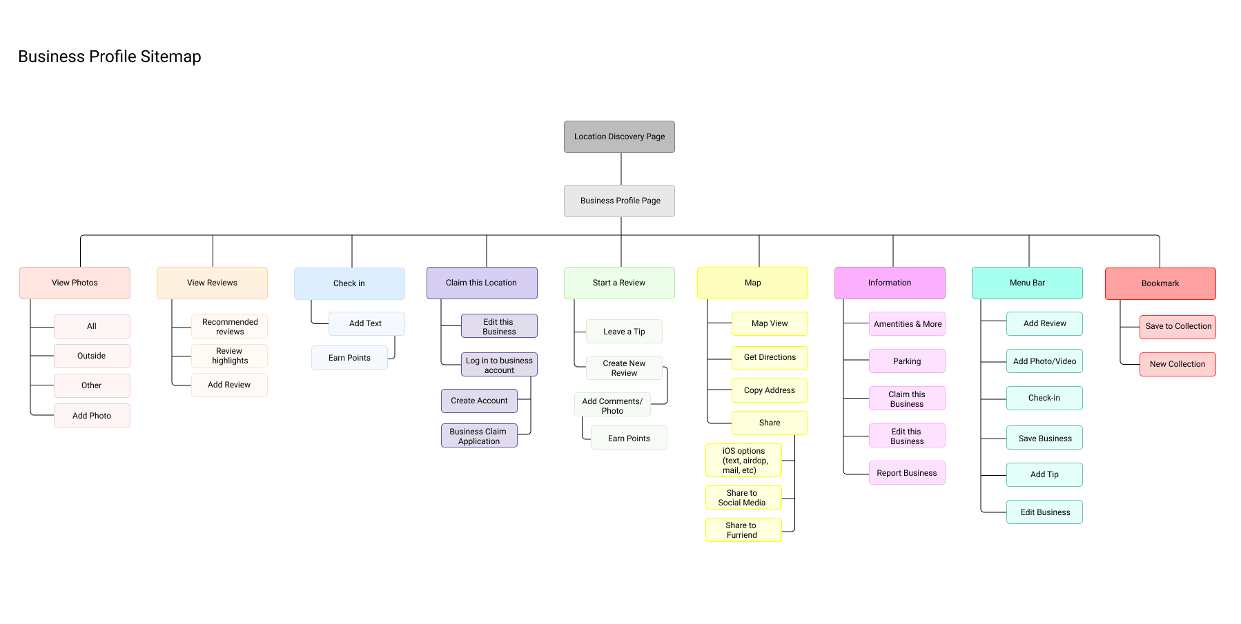
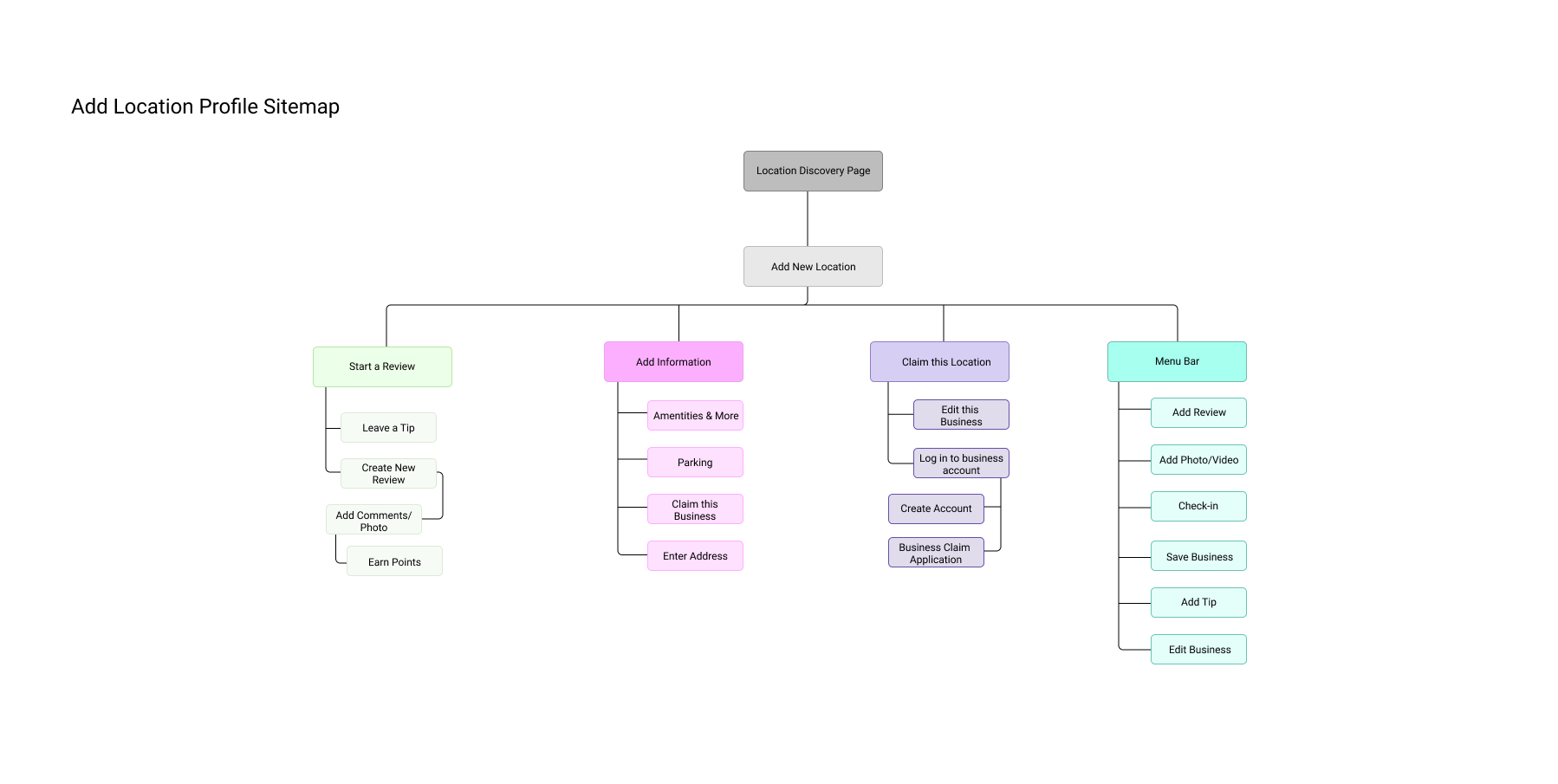
Sitemap
In order to better consolidate the features for the app as well as organize them accordingly, the sitemap was created and used to help plan for the different elements needed in app as well as be able to lay out some of the overlapping features that could be morphed into one strong feature. This also allowed us to understand which features we wanted to build out for the sake of time and finances for this project.
The Design Process
Design
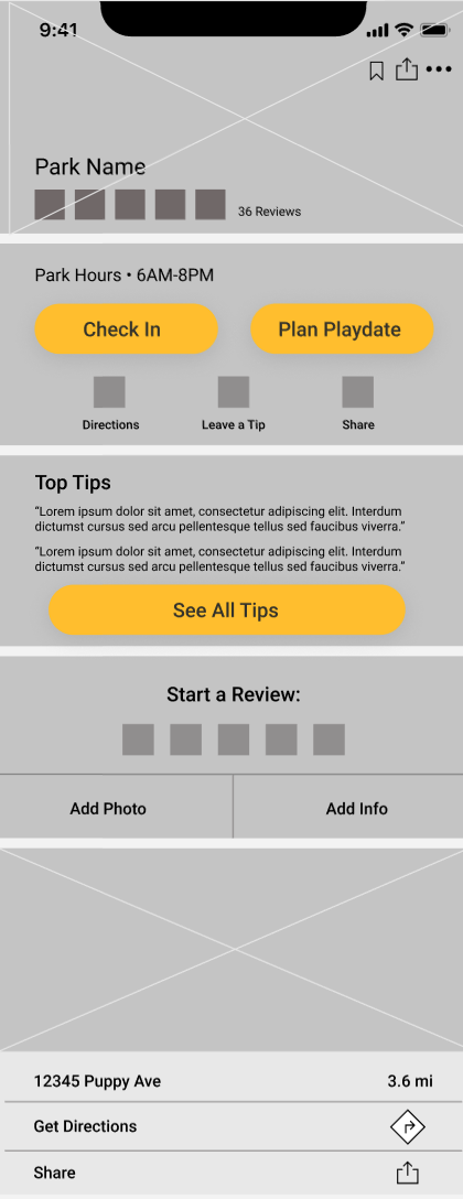
Grey-Scale Wireframes
After sketching different ideas for layouts that would best enhance our user experience as well as minimizing user learning, we began to create low fidelity wireframes to lay out the different components of each screen. While doing so, we kept in mind the common design patterns seen in dog social apps in the market right now and keeping in mind the personas that were created earlier in research.
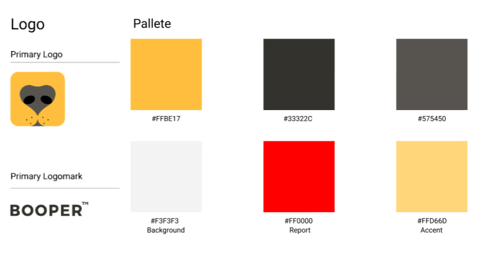
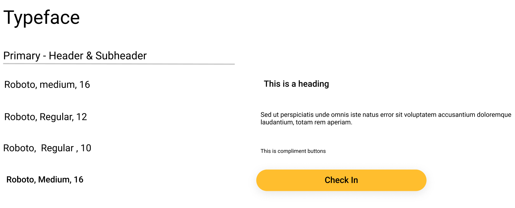
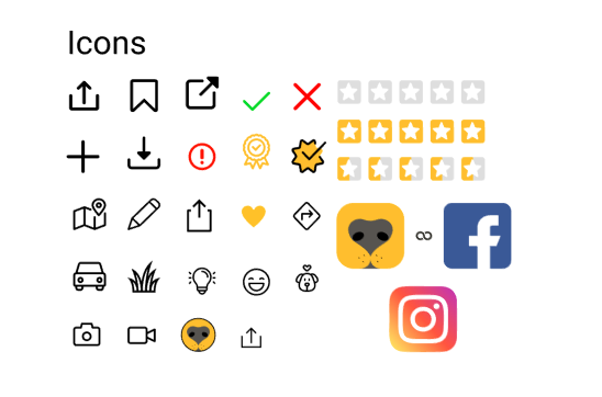
Style Tile
After understanding the different brand messages and meaning, we created the brand style guide to formulate a trusted, modern and fresh look. This will be integrated into the grey scale wireframes accordingly.
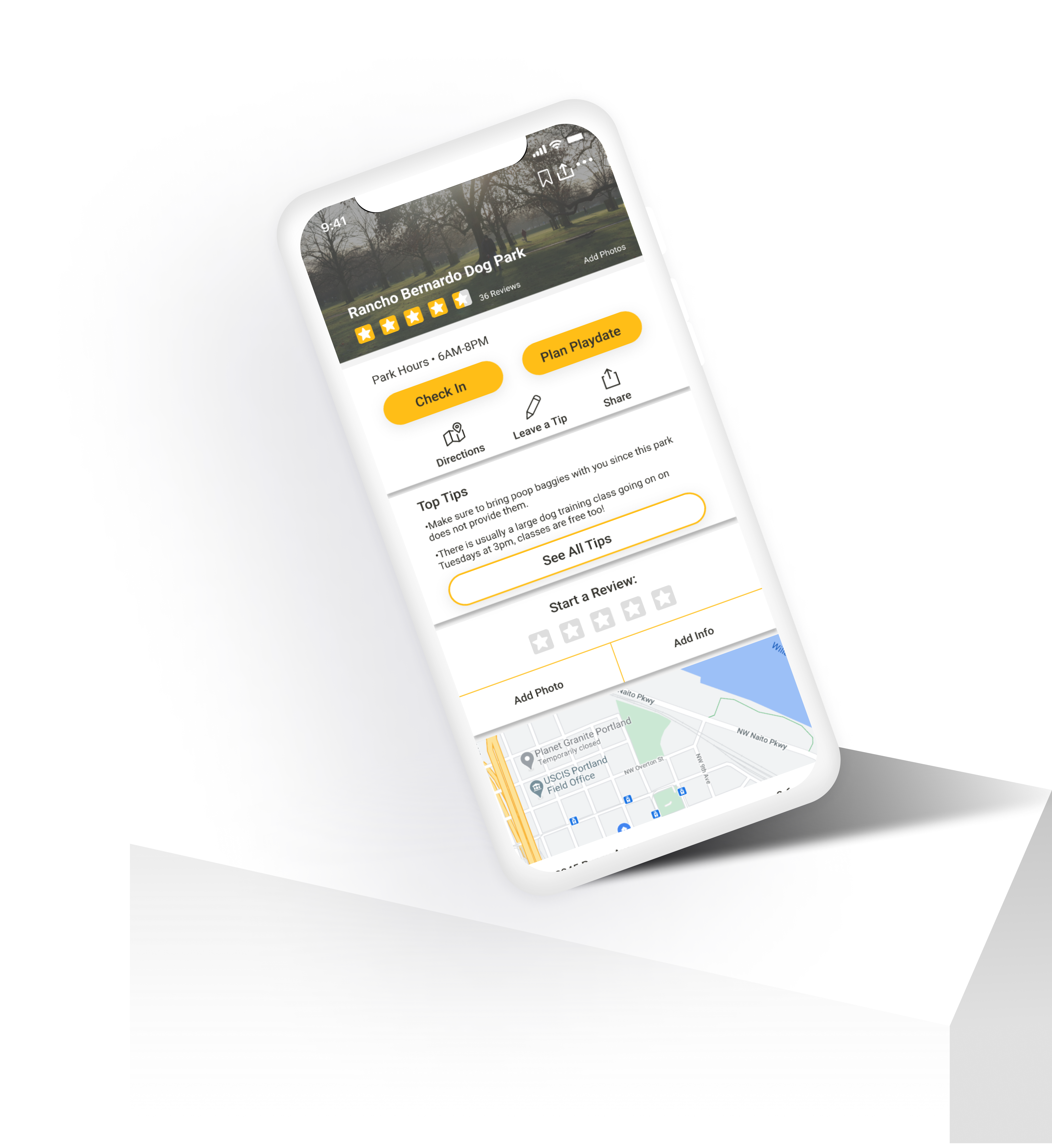
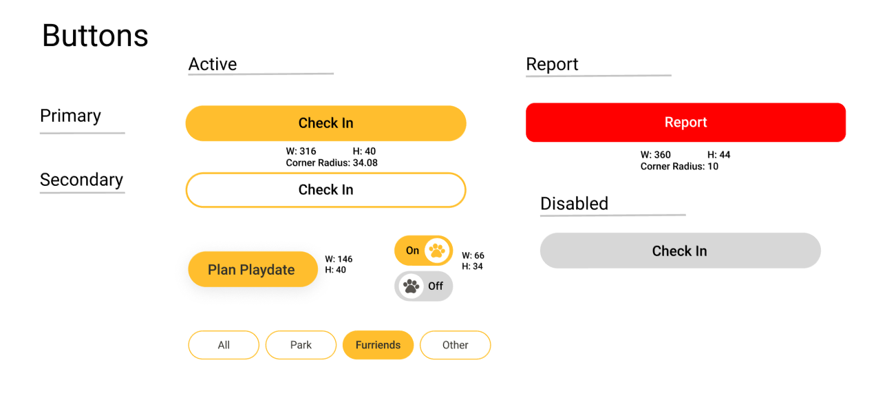
UI Design
While creating the high fidelity wireframes, feedback from mentors and colleagues were given to help improve the usability of this app as well as the UI. After much experimentation in the different options, the final high fidelity version of the app was completed. Due to lack of funds and time, we were only able to build out a few key features for this case study.
The Design Process
Testing the Design
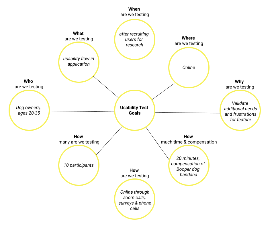
Test Goals
We laid out the 5 W’s (who, what, when, where, why) as well as a few how’s to understand the logistics of user testing. This helped organize the main ideas and issues that may have come up if we had not laid out a plan.
Affinity Map
After conducting user observation with the current design, the affinity map was used to help show the different patterns seen in participants while using the feature. This allowed us to be able to make any final tweaks and finishing polishes to the design.
Reflection
This project helped me understand the importance of understanding budgets within a start-up company when designing. It was a great experience to be able to give and receive viable feedback to help the design process work smoother. The importance of being able to do research and user testing was also something that was important since many of the details of the feature had to go through iteration to find the best design product before passing them over to the development team.
Next Steps
If I were to push this project further, some of the next steps I would take are: •User testing on the revised wireframes. •Pushing out the product further to stakeholders with the company. •Work with the company to gain further revenue through research on user testing.