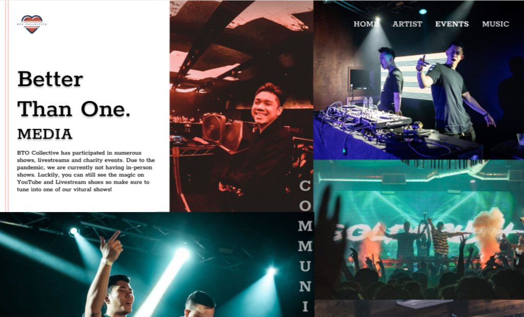
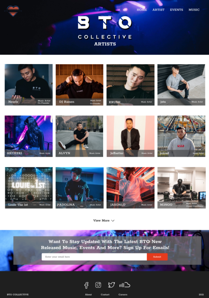
BTO Collective is a predominantly Asian-American EDM collective, with emphasis on musical growth and collaborative support. Standing for “Better Than One” (BTO), the collective was originally founded upon the efforts to collaborate and support one another to achieve greater heights. BTO has expanded to include almost 30 artists with original releases, prominent remixes, and notable DJ mixes to achieve many outstanding milestones. BTO’s aim as a collective is to help inspire people to follow their creative passions and pursuits through collaboration and teamwork.
Challenge BTO Collective needs a responsive website in order to increase fan/artist connection and loyalty.
Role
UX Designer. User research, concept design, wire-framing, branding, UX design, UI design, usability testing and creating responsive designs.
Timeline
4 weeks
Task
Creating a responsive website
Tools
Figma, Slack, Zoom, Figma Prototype, Google Meet
Research
Goals
•Identify user motivations when looking for BTO information
•Identify website trends and marketing strategies
•Research effectiveness of different social media networks in websites
Competitive Analysis
To start, we conducted competitive analysis to understand the existing features and designs implemented into the market currently. With this we were able to pinpoint some of the weakness’ and strength’s of each website to understand the needs and missing features needed in the current market. This also gave us understanding of common design trends seen in music group websites.
User Interviews
Through conducting user interview with 5 participants between the ages of 20 and 25, all whom were fans of BTO Collective, we were able to get a better gauge of what was needed for the application as well as understanding user frustrations and paint points. Asking questions about features seen in other websites were asked as well as information fans would like to see about the music collective were thoroughly discussed.
Motivations
•Finding new music •Discovering new artists •Keeping up with event dates •Looking for artist social media pages •Streaming live streams
Frustrations
•No Artist Navigation •Unorganized event page •Unknown artists in collective •Music sound quality •Untitled tracklists for streaming •Unorganized web navigation
Define
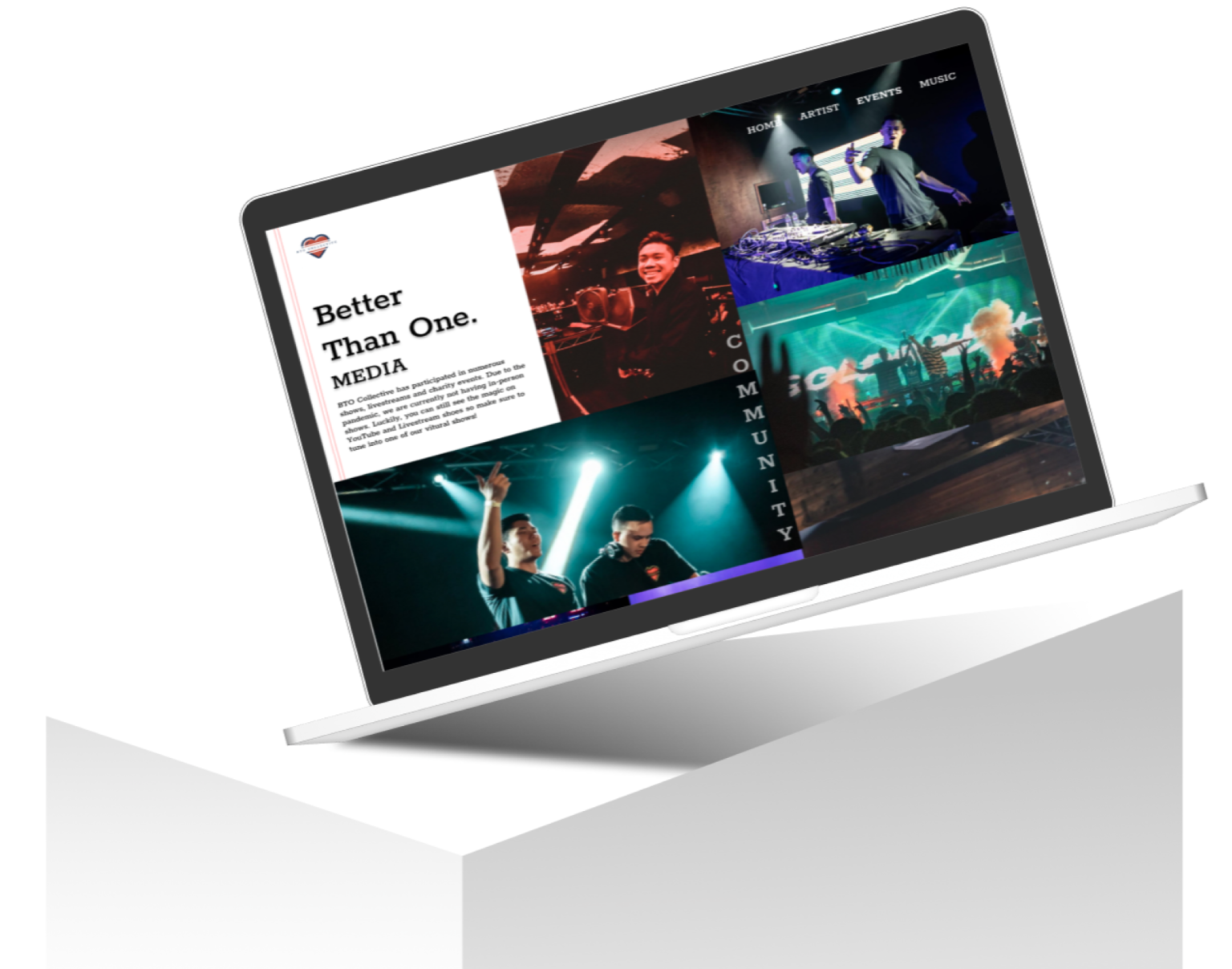
Persona
Meet Chis and Melissa!
After understanding the users needs, habits and frustrations, we wanted to bring this user to life through a persona in order to keep this targeted user in mind while designing. We charted these music lovers personality traits, frustrations and motivations to be able to consolidate their everyday life and emotions as a BTO fan.
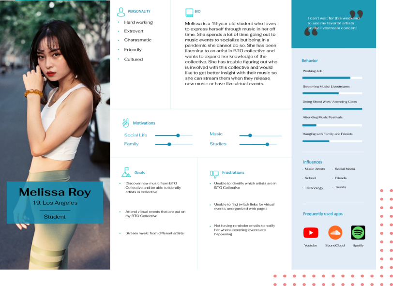
Project Goals
We wanted to be able to understand the goals of the business, customer and technical (the development) while also pointing the similarities and differences they each had. This would help us later in the future to understand how this project would fit into out product market fit.
Ideating Solutions
Sitemap
In order to better consolidate the features for the website as well as organize them accordingly, the sitemap was created and used to help plan for the different elements needed within the website as well as be able to lay out some of the overlapping features that could be turned into one strong coherent feature. This also allowed us to understand which features we wanted to build out for the sake of time and finances for this project.
DESIGN
Sketches
After doing research we and understanding different market designs as well as the different features and elements wanted in the app, we began sketching our wireframes in order to rule out the different options of sketches as well as jotting down new ideas before moving them digitally to Figma.
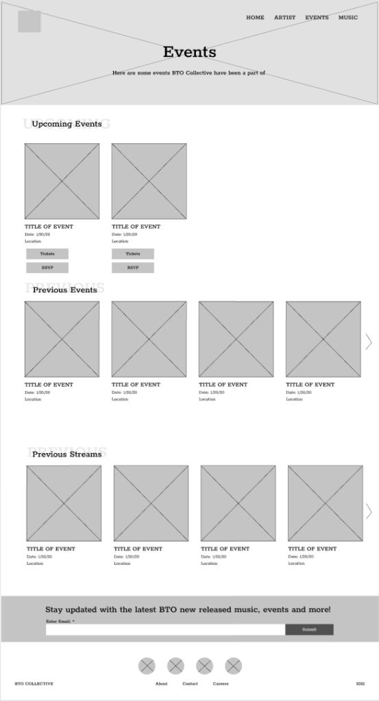
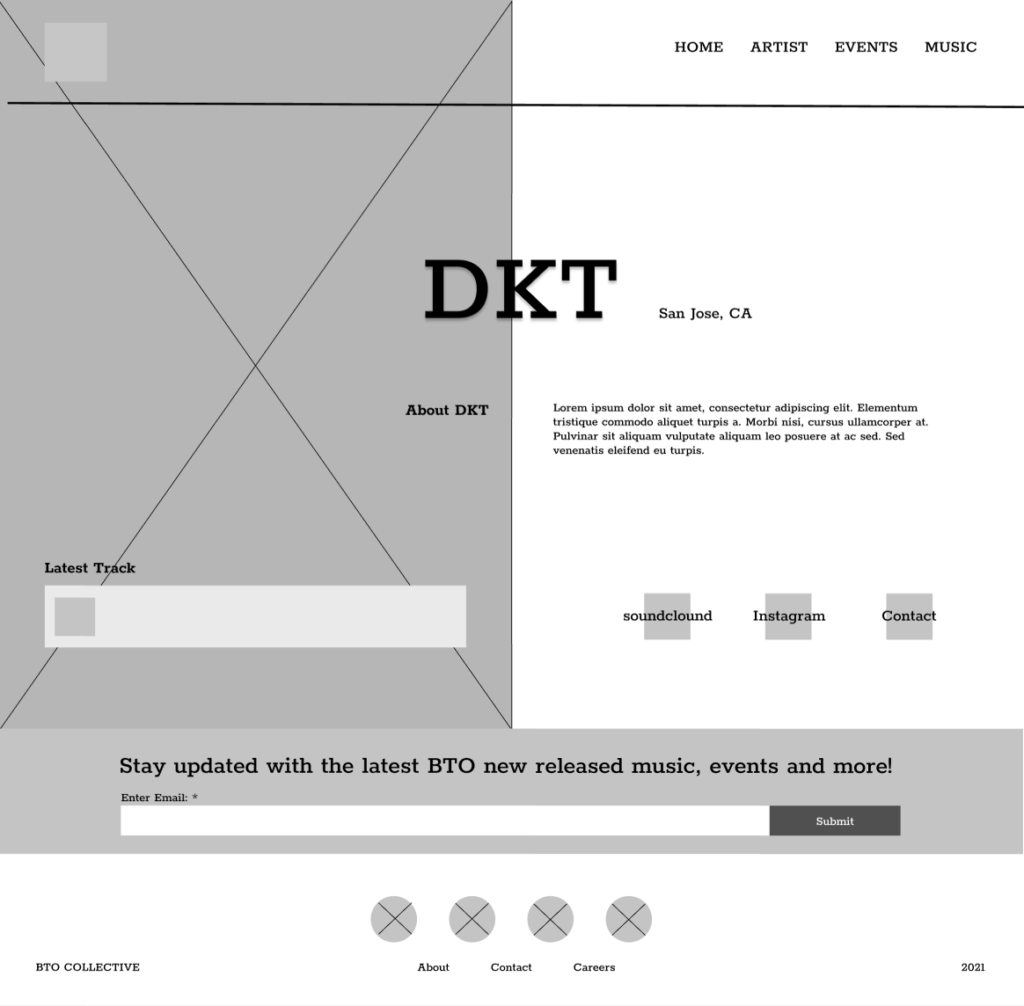
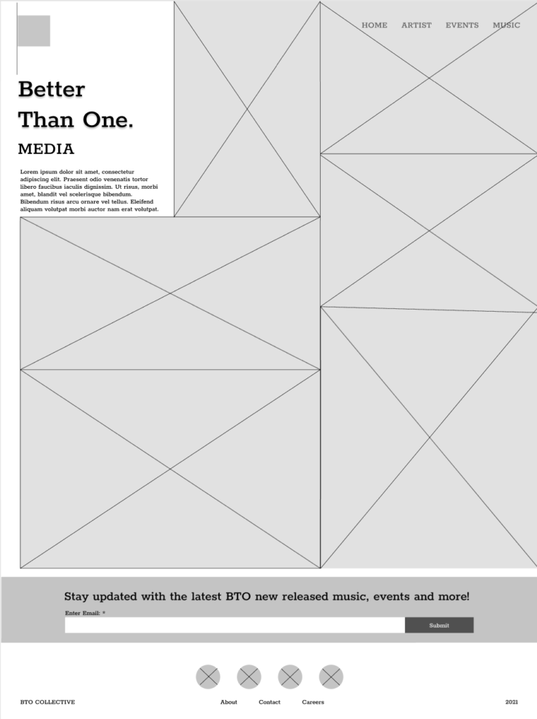
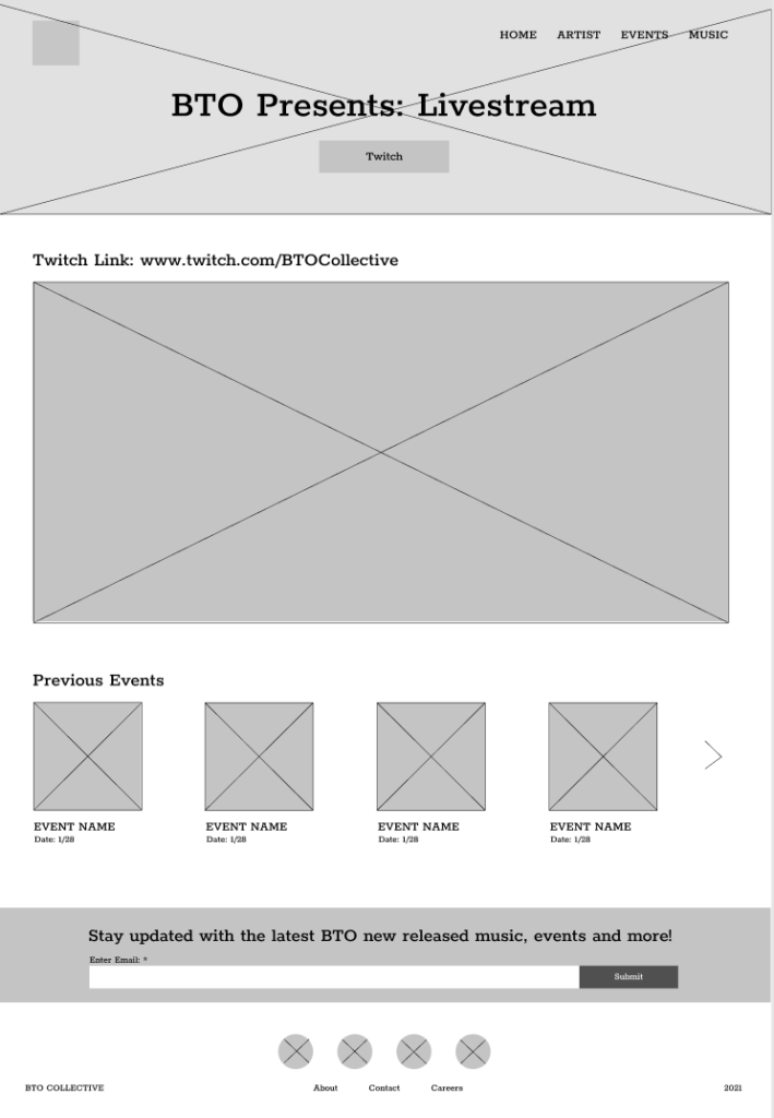
Grey-Scale Wireframes
After sketching different ideas for layouts that would best enhance our user experience as well as minimizing user learning, we began to create low fidelity wireframes to lay out the different components of each screen. While doing so, we kept in mind the common design patterns seen in traveling apps in the market right now and keeping in mind the personas that were created earlier in research.
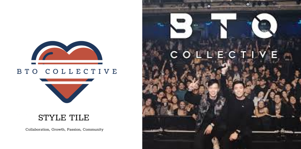
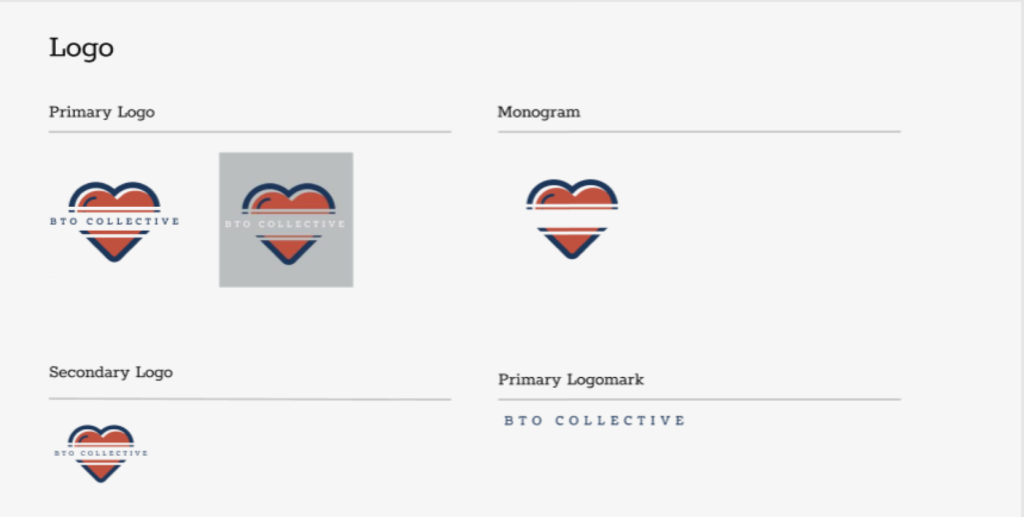
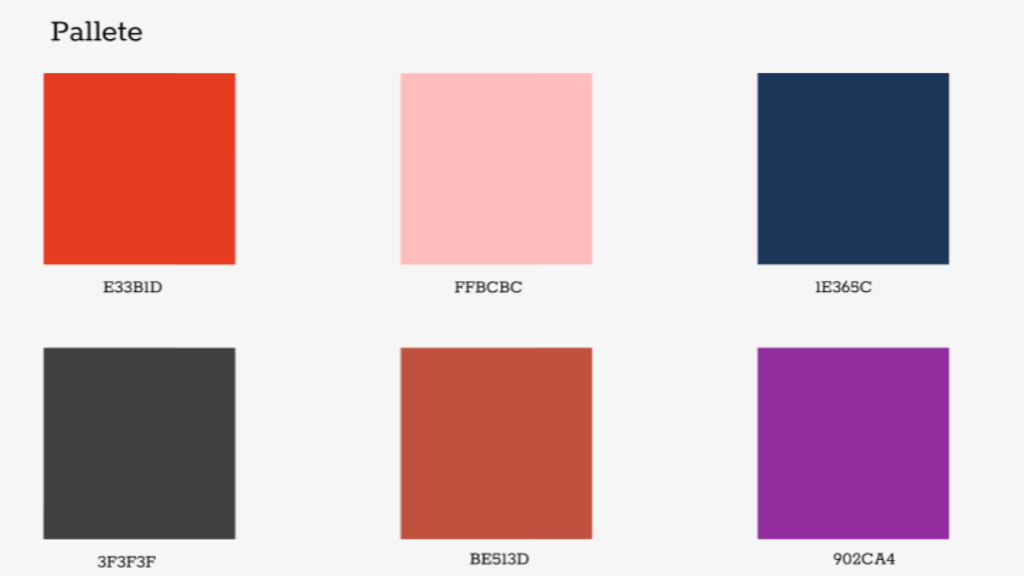
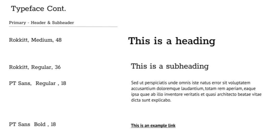
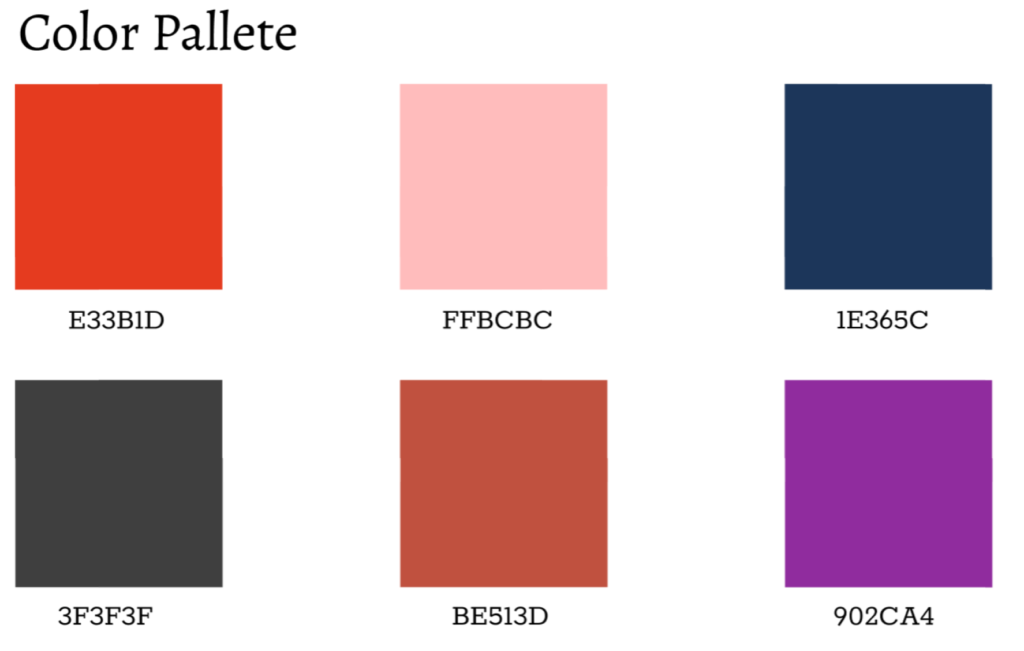
Style Tile
After understanding the different brand messages and meaning, we created the brand style guide to formulate a modern and fresh look while keeping the integrity of the brand. This will be integrated into the greyscale wireframes accordingly.
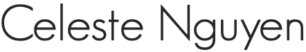
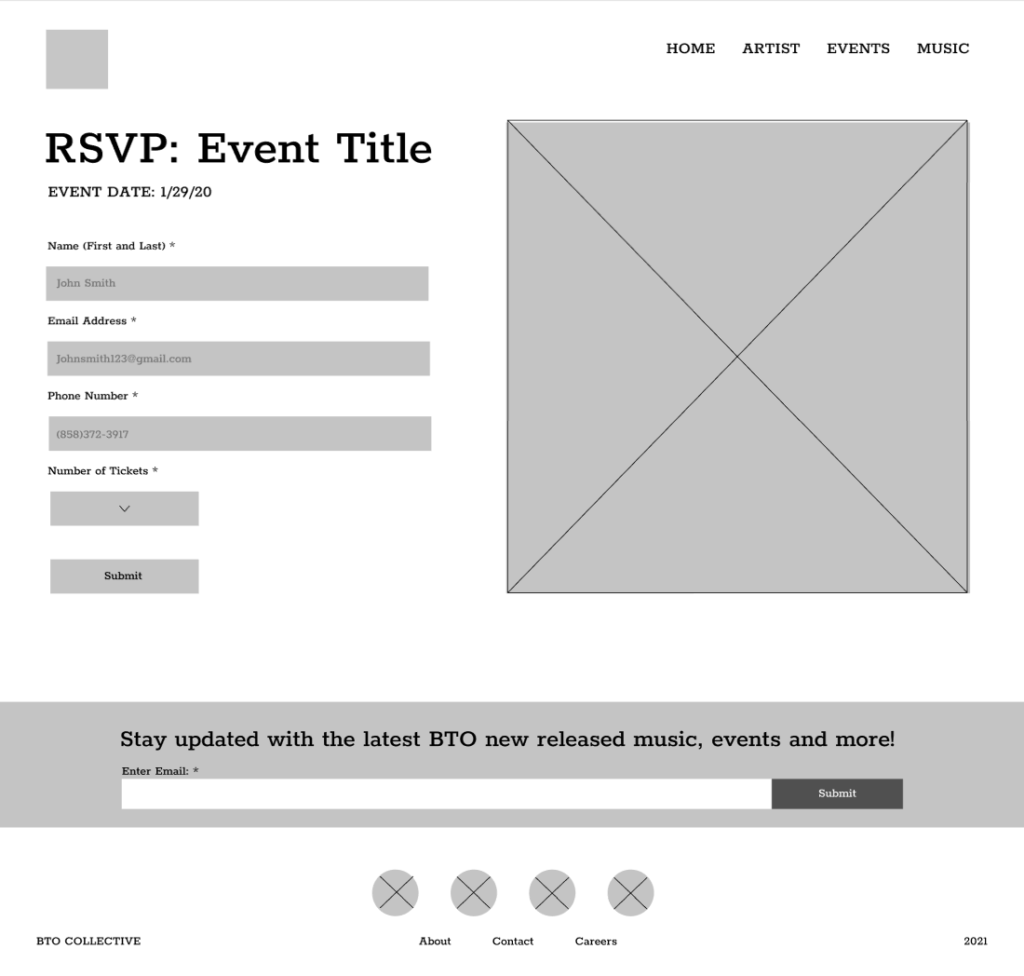
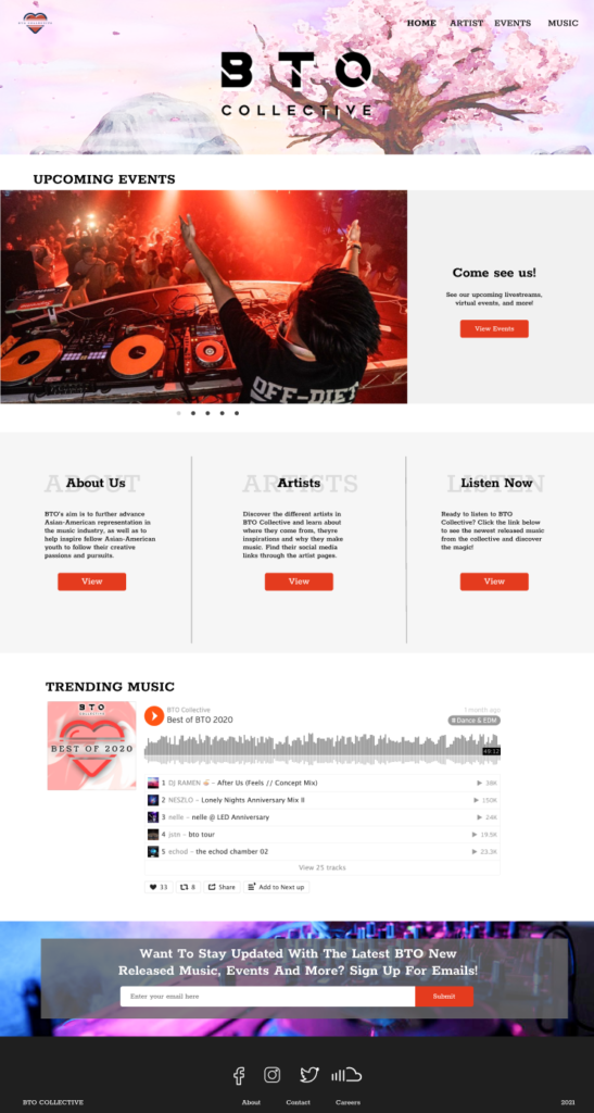
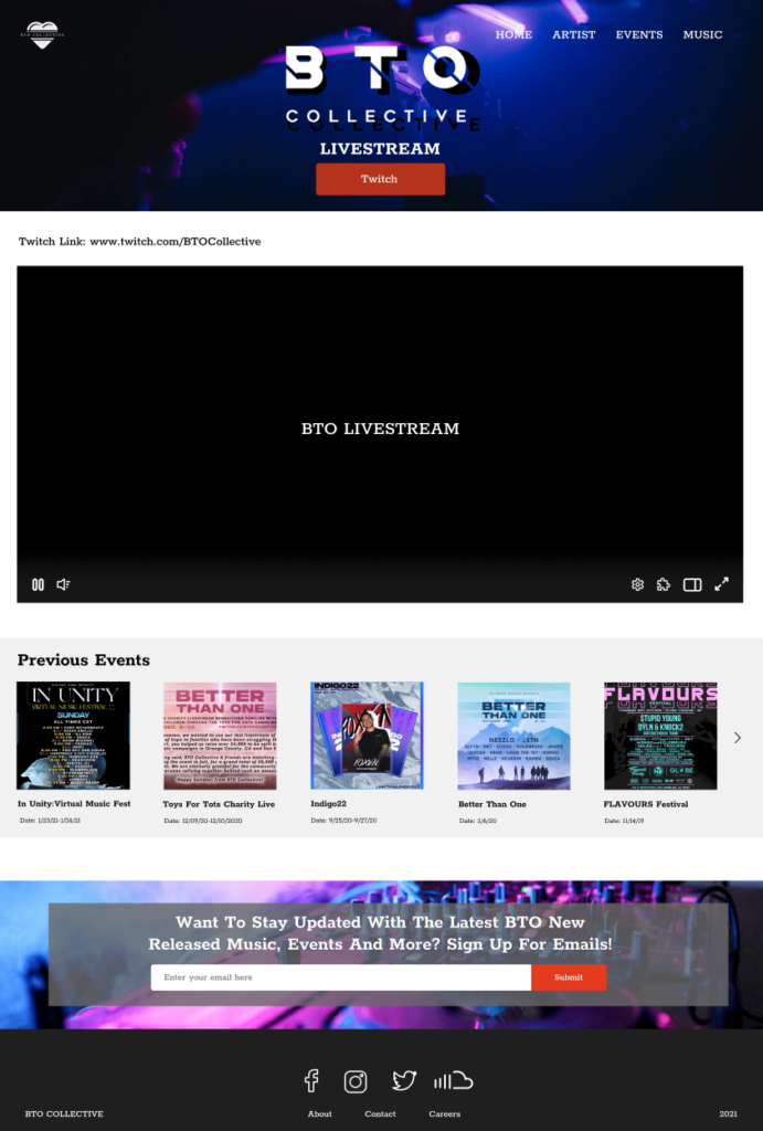
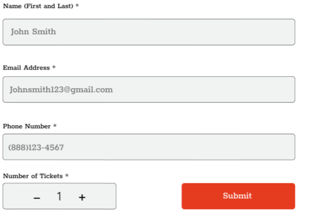
UI Design
While creating the high fidelity wireframes, feedback from mentors and colleagues were given to help improve the usability of this app as well as the UI. After much experimentation in the different options, the final high fidelity version of the app was completed. Due to lack of funds and time, we were only able to build out a few key features for this case study.
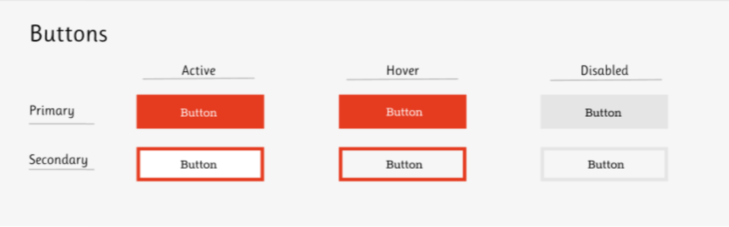
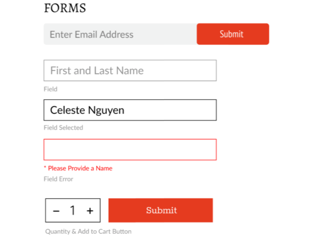
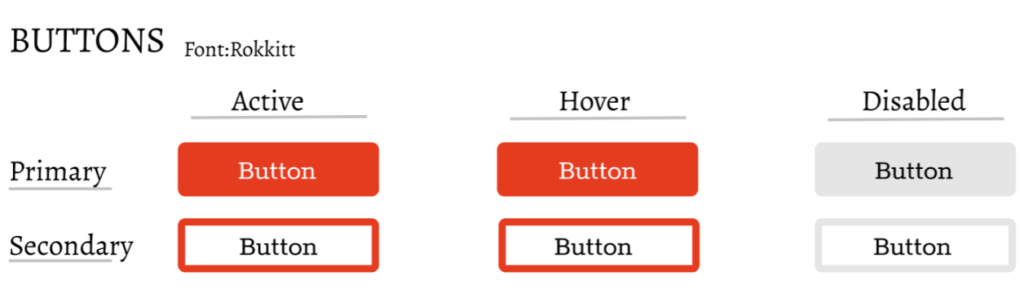
UI Kit
The UI kit was then made to reflect the different key elements from the wireframes of the BTO website. This kit helps keep everything organized for future iterations of the website if needed.
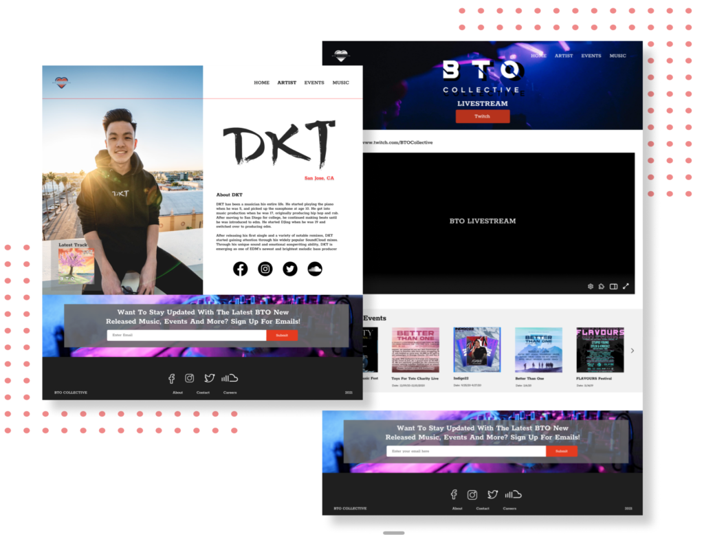
Prototype
After creating the high-fidelity wireframes designed in Figma, the Figma prototype tool was used to build a hi-fidelity, limited functionality prototype for usability testing in order to observe how users interact with the site and identify where different improvements could be made.
This project allowed me to understandthe dynamic of working with an existing brand and matching their existing branding with a new platform. Learning the best possible ways to find solutions to the pain point of the feeling of disconnect between the collective and fandom was interesting. I also used this project to understand the needs and frustrations of users in the music industry and using my abilities through design to fix these problems they face.
Next Steps
If I were to push this project further, some of the next steps I would take are: •User testing on the revised wireframes. •Pushing out the product further to stakeholders with the company. •Work with developers to get this website out and rolling for the users to start listening to BTO Collective and helping their company grow globally.