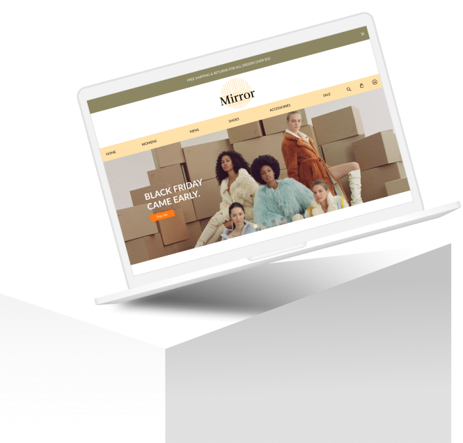
Mirror
Mirror is a clothing brand that was established back in 1993. Since then, they’ve expanded to have 400 stores across 32 countries worldwide. While they have had a lot of success offline, they are very late in the game to enter the online clothing market. For this project, I conducted research, did a complete brand makeover, and designed a responsive website to help meet Mirror’s business goals and also their users’ goals.
*Note: This project is based on a fictional brand.
Project Overview
Challenge
Mirror does not have an online presence and wants to capitalize on online sales to secure its brand position in e-commerce. They also want to rebrand their company to spotlight their shift towards sustainable clothing.
Role
UX Designer. User research, concept design, wire-framing, branding, UX design, UI design, usability testing and creating responsive designs.
Timeline
8 weeks
Task
Rebranding and responsive website
Tools
Figma, Slack, Zoom, OptimalSort

Research
Goals
•Identify online shopping motivations with users
•Create a new modern logo for brand
•Identify clothing trends and marketing strategies for e-commerce websites
•Research effectiveness of filtering systems
Competitive Analysis
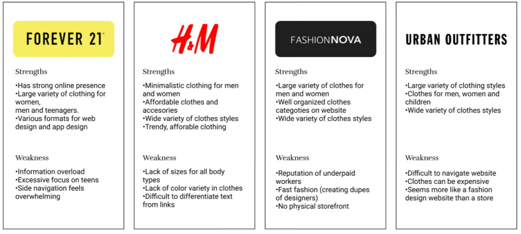
After conducting market research to understand the general ideas of what was on the market for e-commerce websites, we used competitive analysis to understand the strengths and weaknesses of the direct competitors of Mirror. It was learned that e-commerce sales were growing at an exponential rate with a various amount of customers with different backgrounds. E-commerce will make up 22% of global retail sales by 2023. Designers must constantly stay updated with the latest trends to find affordable clothing to keep customers coming back to store website. The direct competitors of Mirror were then analyzed in order to see what things worked and didn’t work when looking for clothing on these e-commerce websites.
User Interviews
Trying to get a more personal understanding of who may be a customer of Mirror, we did interviews with 10 participants, between the ages of 18 to 24 who love to shop online, in order to dive deeper into the people who were shopping at Mirror and what these users patterns like while shopping online and noting their experiences while online shopping.
This research focused on using open ended questions and kept the research goals in mind:
1. Identify online shopping motivations with users
2. Create new modern logo for brand
3. Identify clothing trends and marketing strategies for e-commerce websites
4. Research effectiveness of filtration systems
Empathy Map
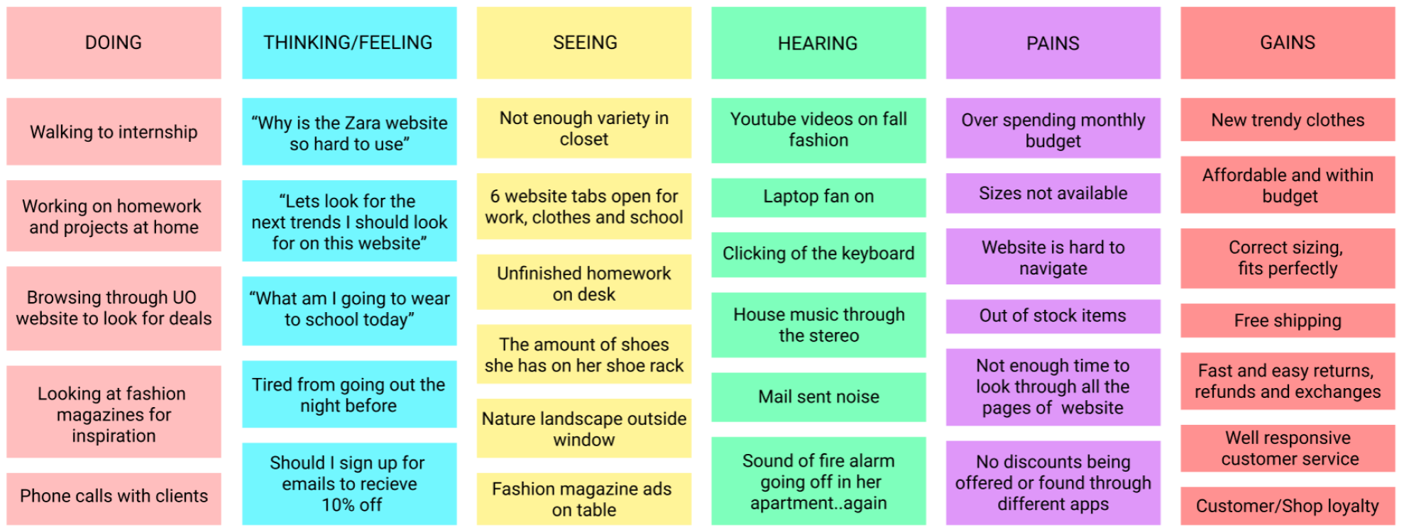
After gathering the information gained from the interviews, an empathy map was created for a provisional persona who was created as a fashion design student. Having an understanding of her motivations and frustrations were while she has while looking for sustainable clothing was important to note.
Motivations
•Looking for specific types of clothing when shopping
•Shop at stores that had well priced items in their price range
•New trendy clothes in photographs throughout the websites
•Shop at websites that had easy navigation and good customer service
Frustrations
•Frustrated when items were not in stock when checking out
•Disliked when clothes that arrived were damaged or not true to size
•Frustrated due to the lack of sizing options
•Did not like confusing return policies

Define
Persona
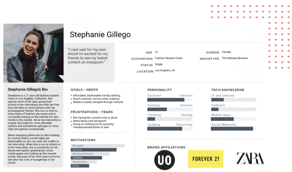
Meet Stephanie Gillego!
To really understand who our users are, we wanted to create an ‘ideal’ person who fit the criteria for who would be visiting the Mirror website. We put together the information we gathered from our previous research to create a persona to keep in mind before moving forward with the rest of our design process.
Project Goals
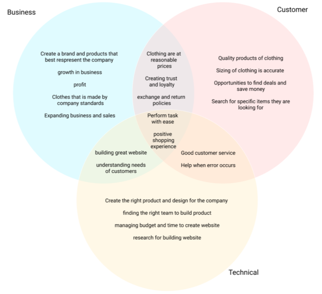
To consolidate the different goals seen from the business, customer and technical side of an e-commerce website, we mapped out the differences and similarities to one another. This helps us have a uniform view of the center goals and different elements that need to be kept in mind while creating this experience for users.
Feature Roadmap & Card Sorting
Because Mirror has a large inventory of items, it is important to provide a clear path for the users to navigate through it. To get a better understanding for categories in e-commerce websites, a feature roadmap and card sorting was used to give the users the best overall experience.
After conducting an online, open card sort remotely with 10 participants using OptimalSort in order to observe how people naturally organize a variety of clothing items. From this, it was discovered that the most common trends were sorting the items by the type of clothing (tops, bottoms, accessories, etc.). Using this information to continue to gather the information architecture of Mirror’s new website by creating a site map.
Sitemap
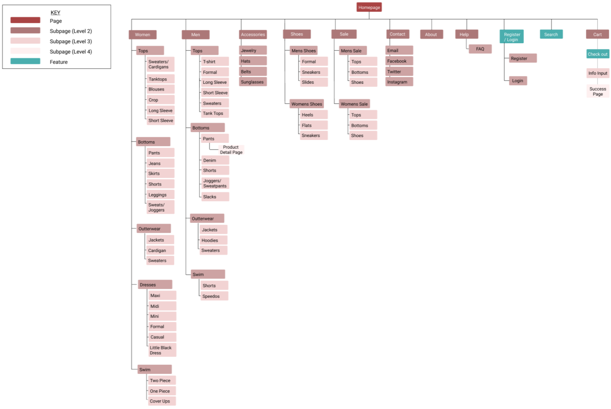
Now that it was known how people expected to see the different types of clothing items organized with using card sorting, then went on to do more research by looking at the common trends for navigation on competitors’ websites. In order to better consolidate the features for the app as well as organize them accordingly, the sitemap was created and used to help plan for the different elements needed in app as well as be able to lay out some of the overlapping features that could be morphed into one strong feature. This also allowed us to understand which features we wanted to build out for the sake of time and finances for this project.

Ideating Solutions
Task flow
We created a specific task for our user to complete, purchasing a skirt, which allows us to see the correct wireframes and steps to get the task finished.

After understanding the frustrations and motivations of the users, we put together a user flow to further empathize with the personas we created. We did so to be able to really understand the steps the user has to go through to find clothes with and without filtration systems. This user flow explored the different paths that the persona would take while interacting with the website and identified the key pages and features she would interact with. This helps us minimize excess scrolling and clicking throughout the app.
Sketches
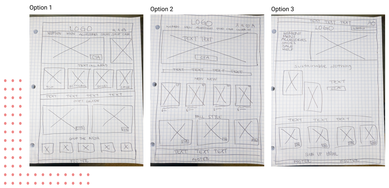
After doing research and understanding different market designs as well as the different features and elements wanted in the app, we began sketching our wireframes in order to rule out the different options of sketches as well as jotting down new ideas before moving them digitally to Figma. These were drawn out from different ideas for the layout of Mirror’s website reflecting the users needs while also implementing common design patterns seen saw while researching e-commerce webpages.
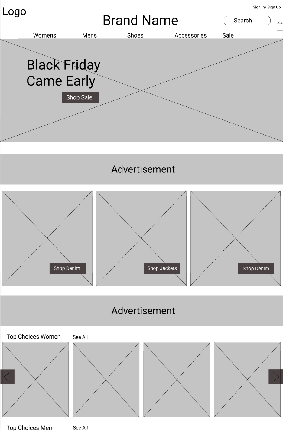
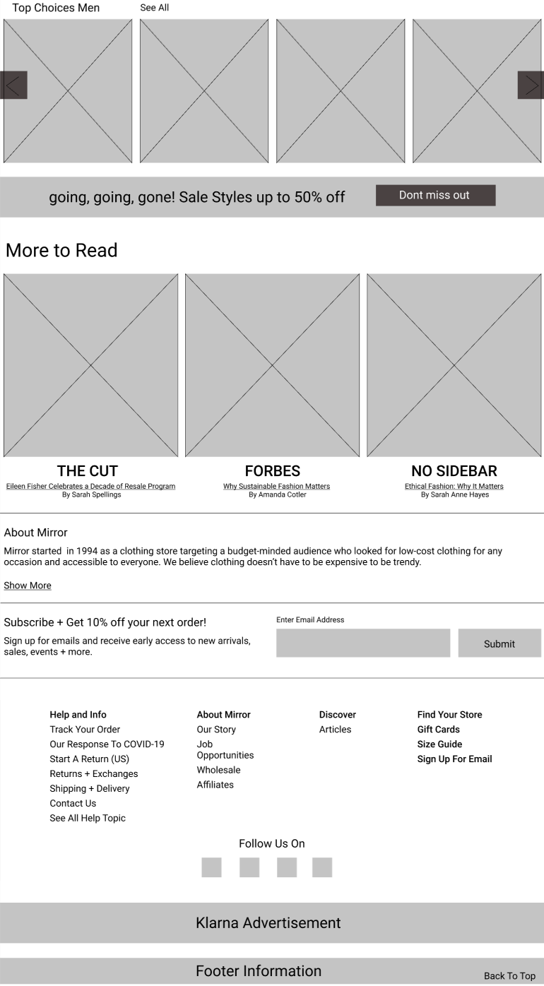
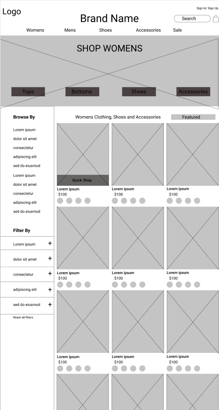
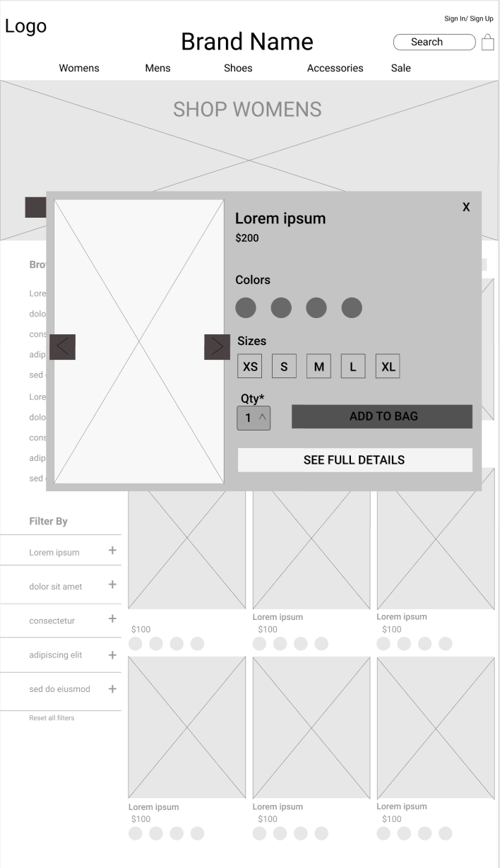
Grey-Scale Wireframes
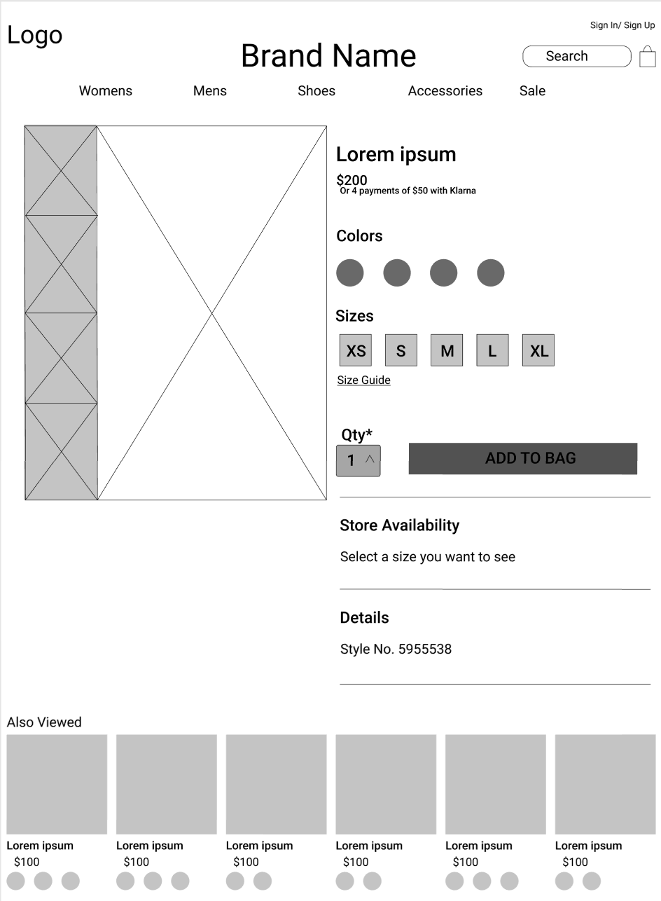
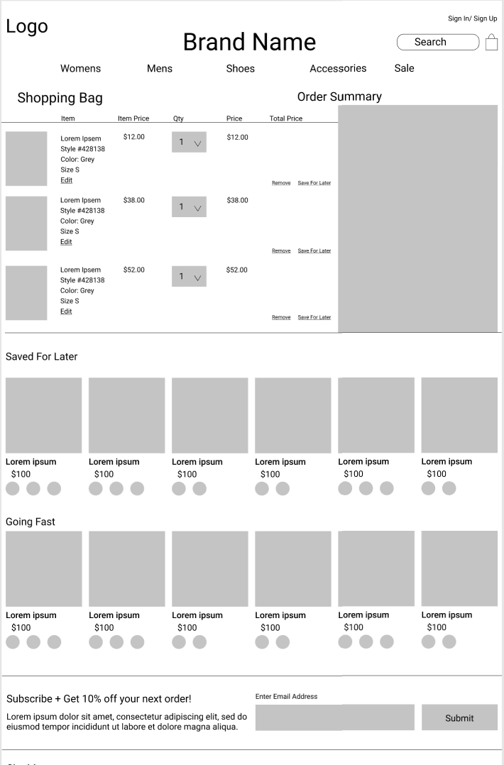
After sketching different ideas for layouts that would best enhance our user experience as well as minimize user learning, we began to create low-fidelity wireframes to layout the different components of each screen. While doing so, we kept in mind the common design patterns seen in e-commerce websites in the market right now and kept in mind the personas that were created earlier in research.
Logo Design
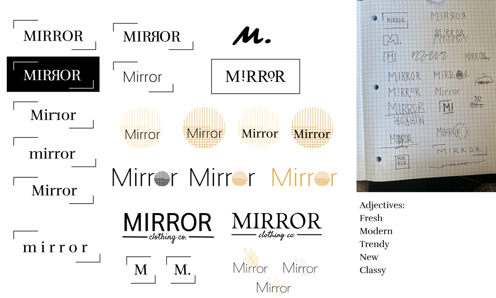
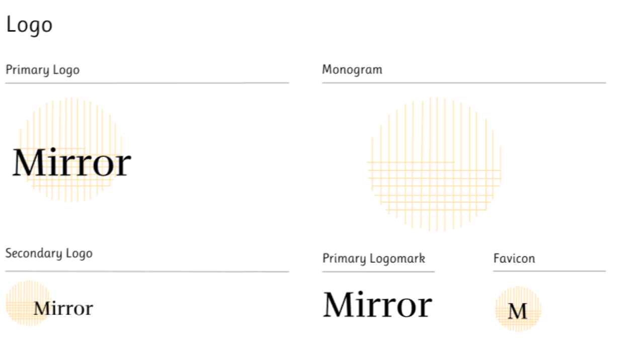
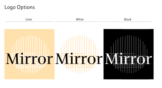
Since the founders of Mirror wanted to rebrand their current brand to something more modern and trendy, we came up with a modern and abstract logo design the would reflect this.
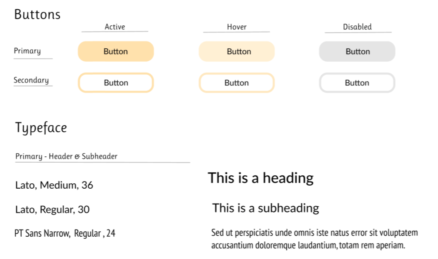
Style Tile
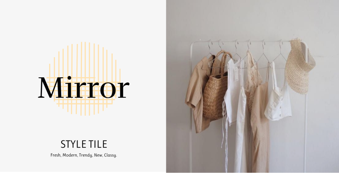
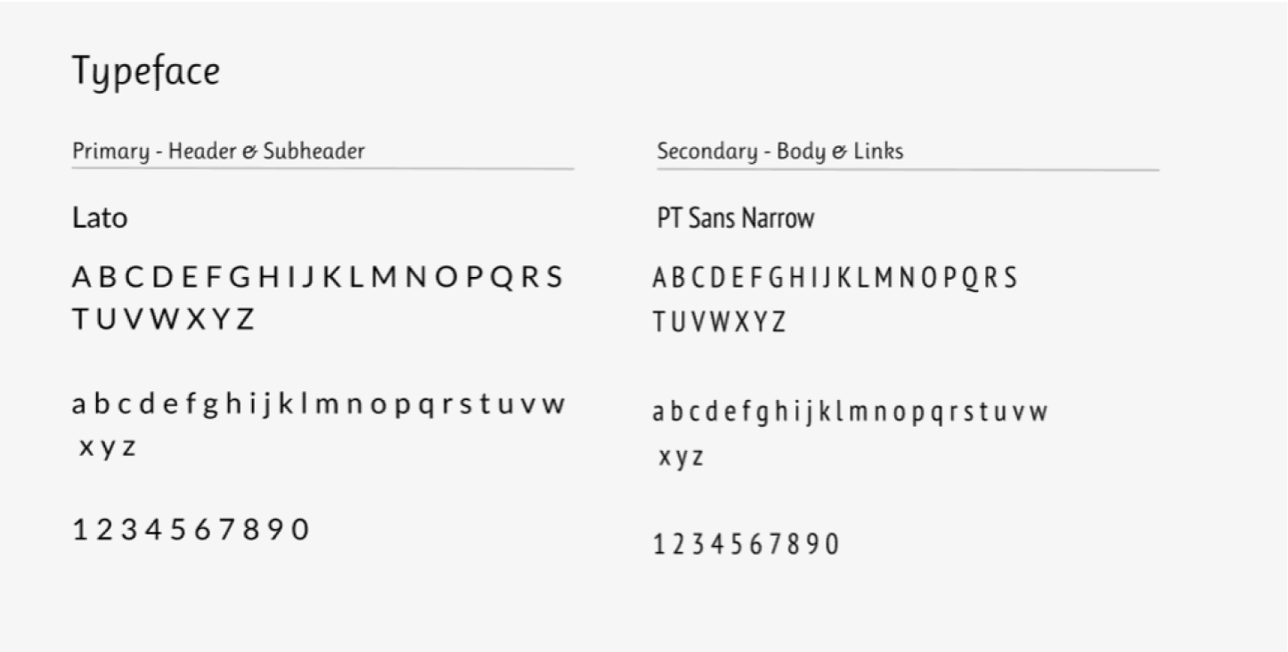
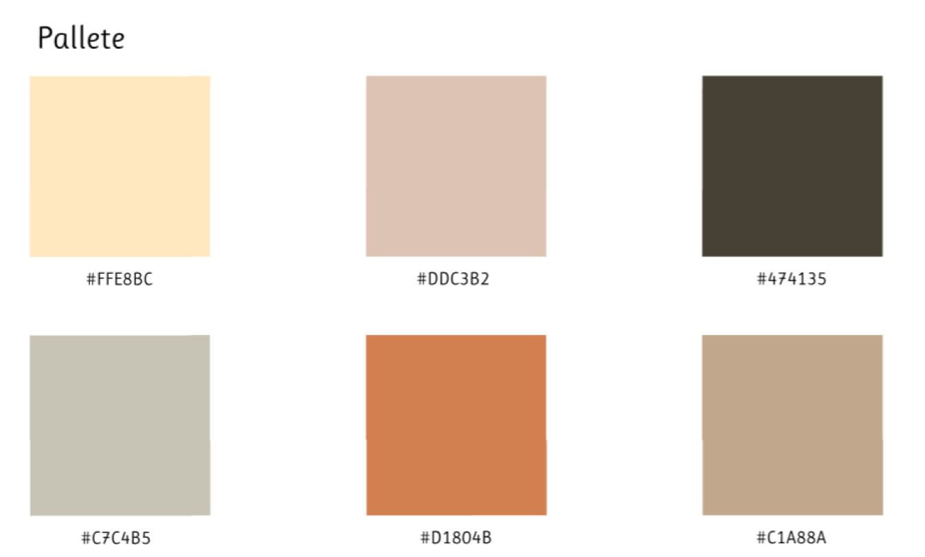
After understanding the different brand messages and meaning, we created the brand style guide to formulate a trendy, modern and fresh look. This will be integrated into the grey scale wireframes accordingly.
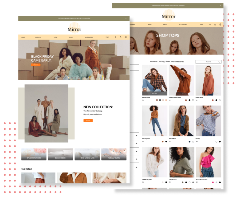
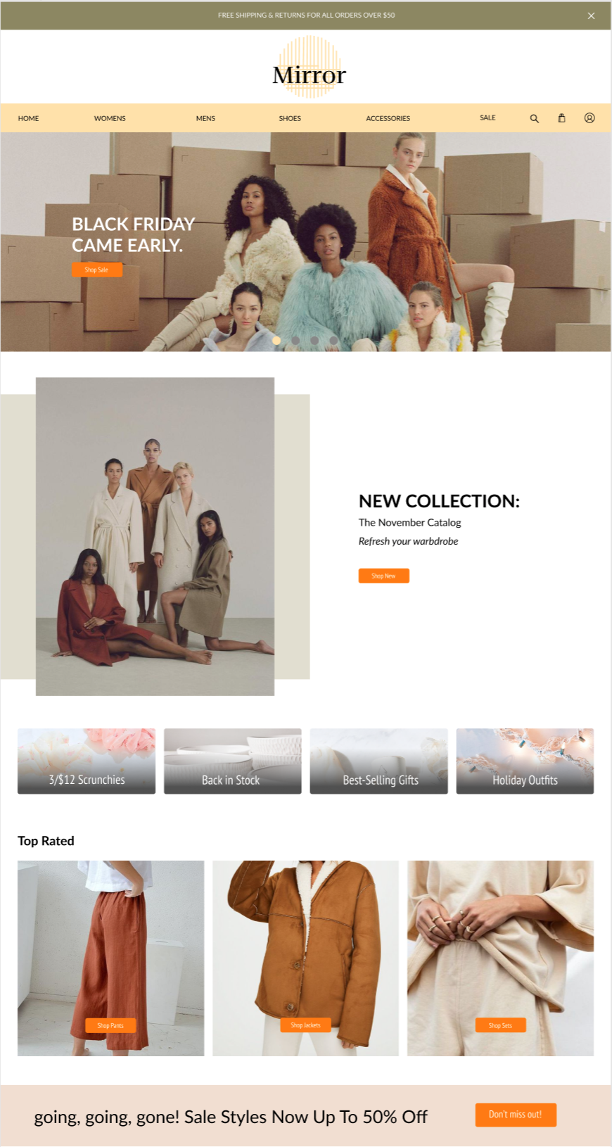
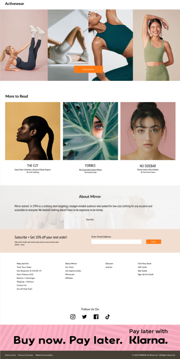
UI Design
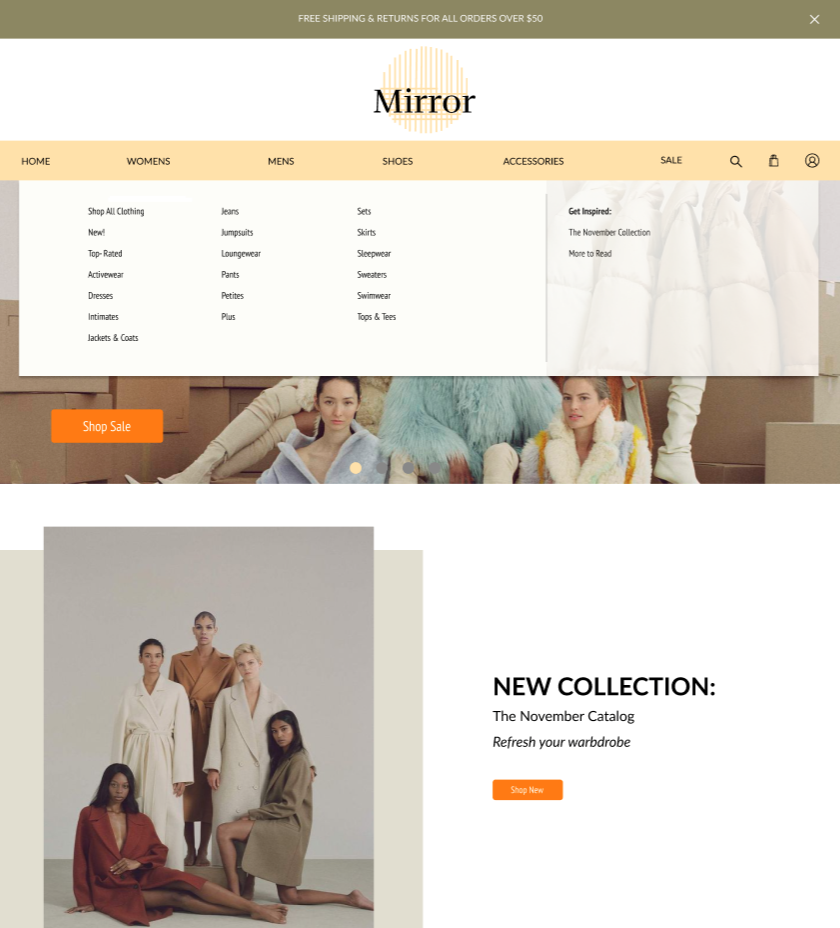
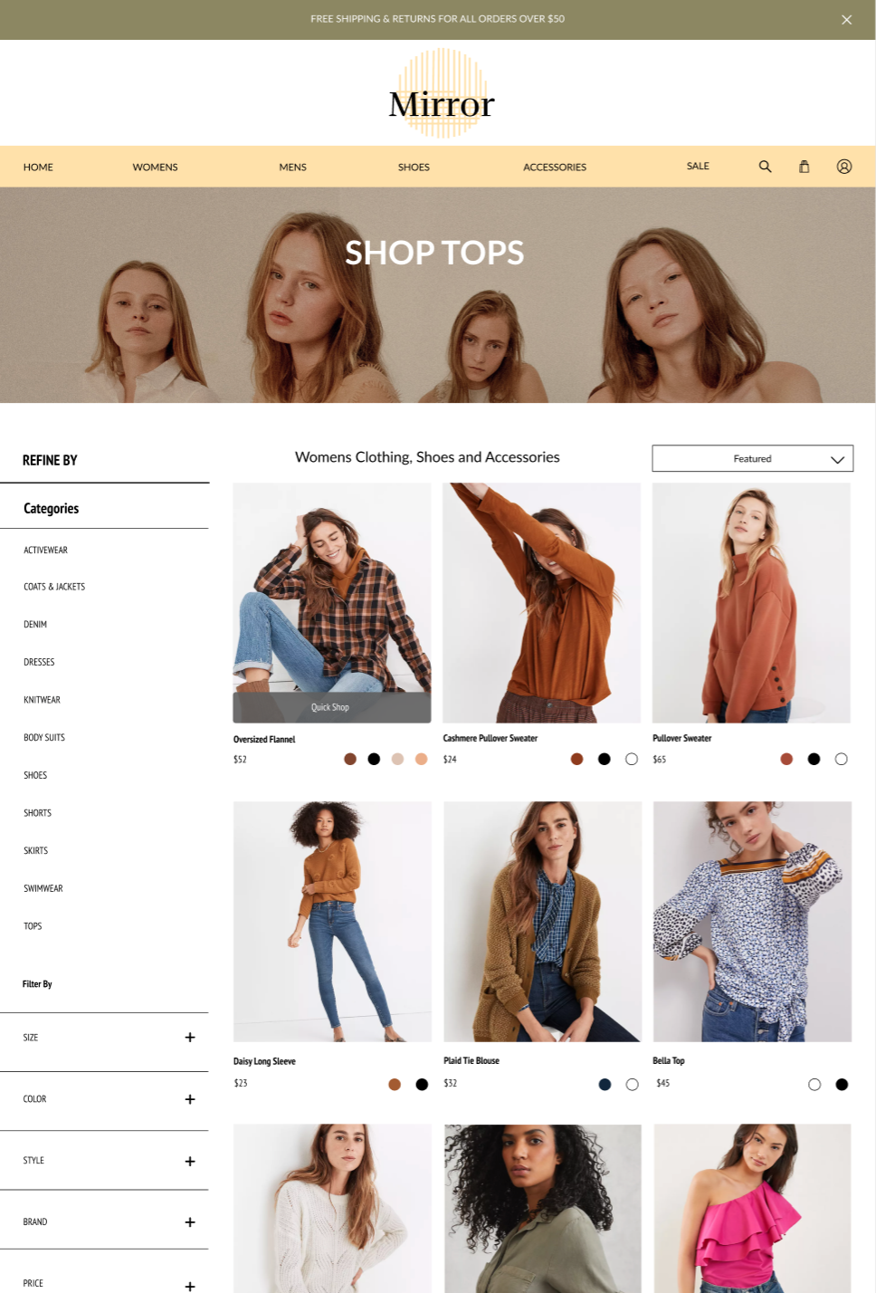
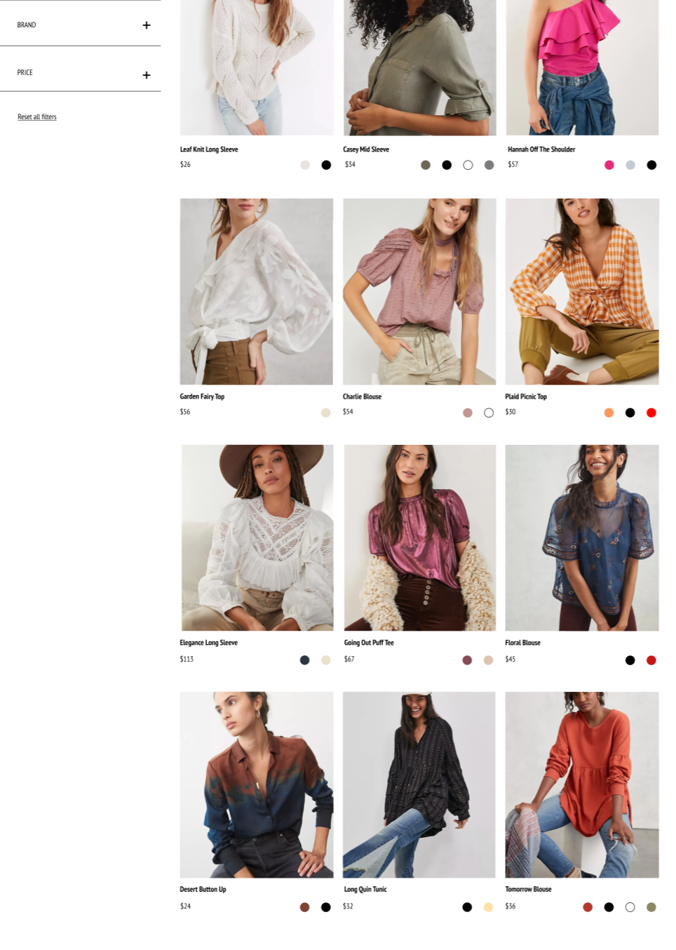
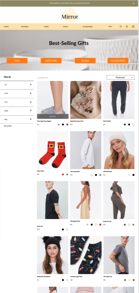
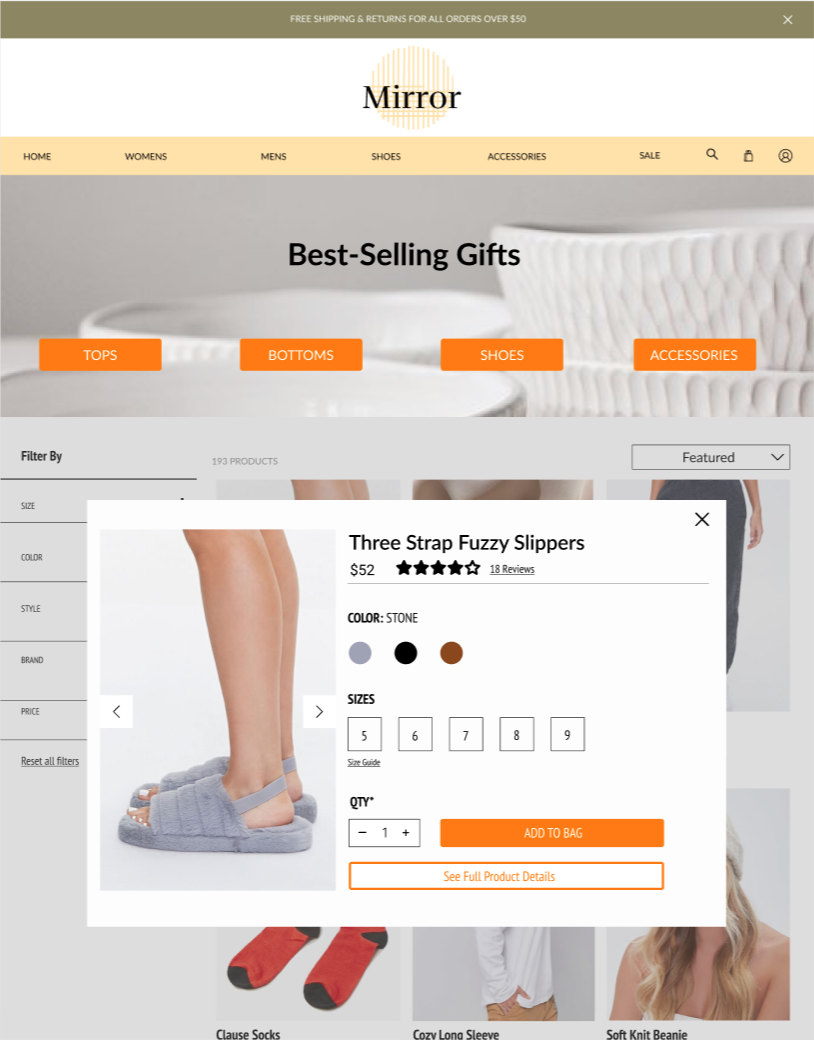
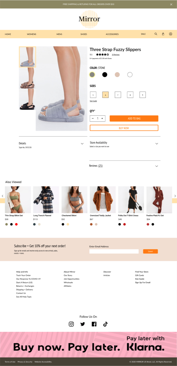
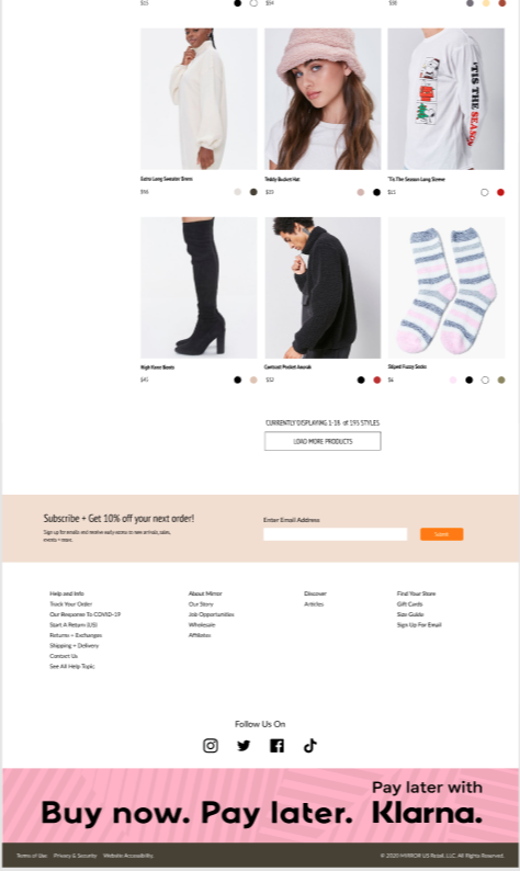
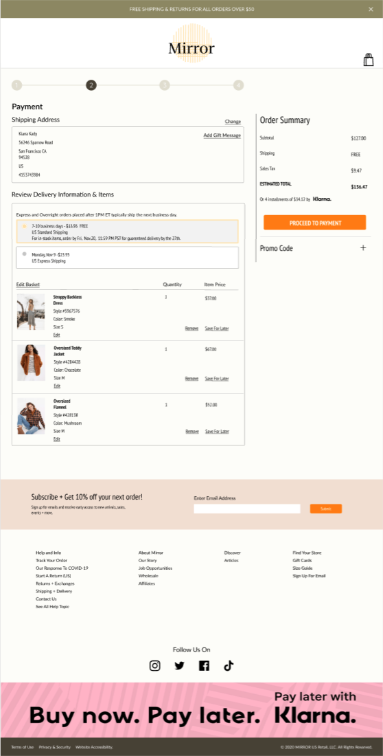
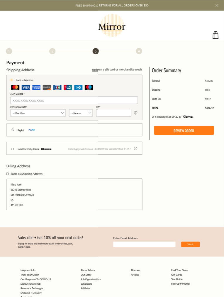
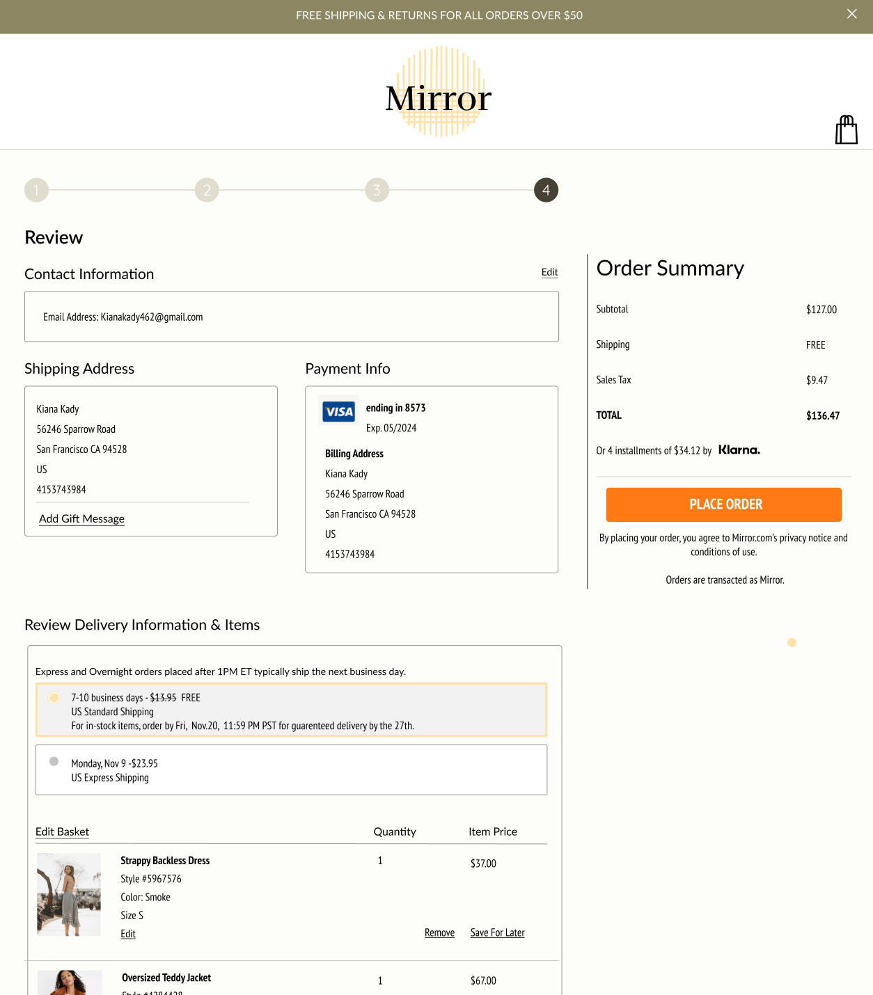
While creating the high-fidelity wireframes, feedback from mentors and colleagues were given to help improve the usability of the website as well as the UI. After much experimentation in the different options, the final high-fidelity version of the app was completed.
UI Kit
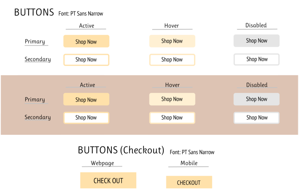
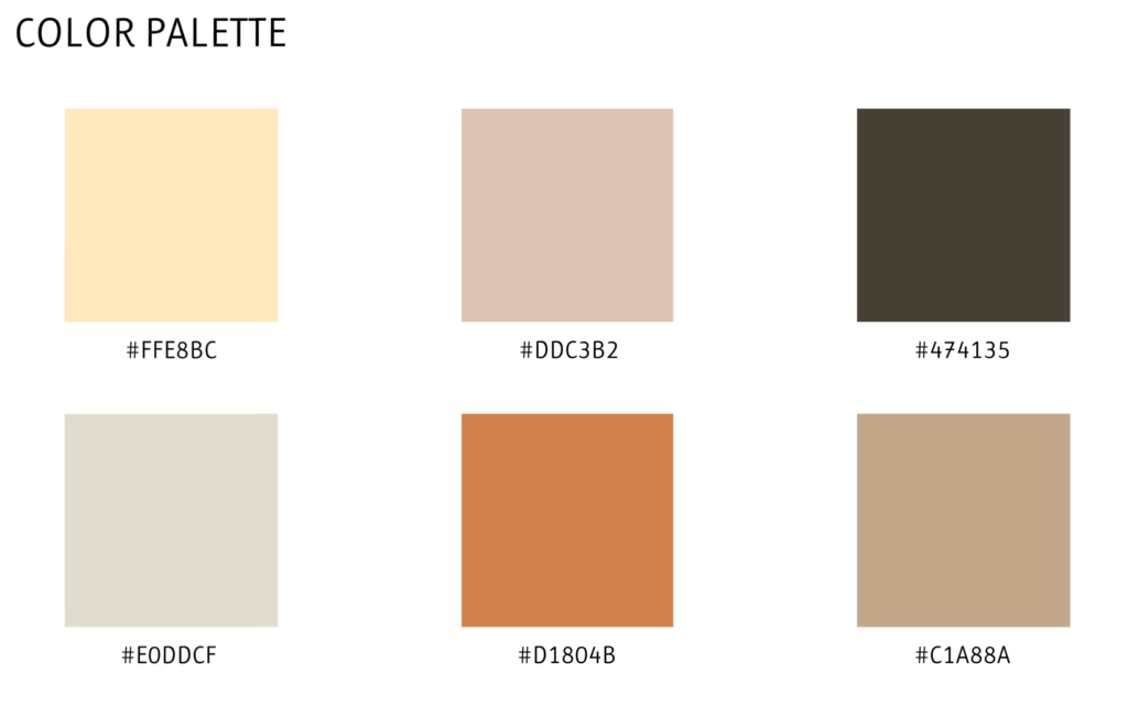
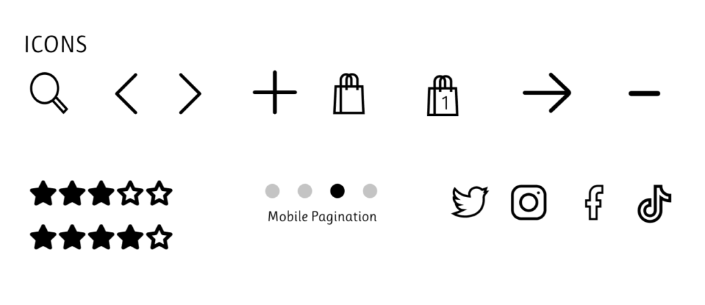
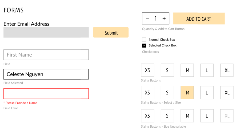
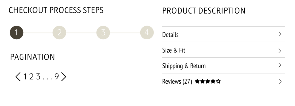
We made a UI kit to demonstrate the different elements of the webpage including the color pallet, typography, icons, buttons, and error messages. This will help set a guide for any further iterations to the webpage.
Prototype
After creating the high-fidelity wireframes designed in Figma, the Figma prototype tool was used to build a hi-fidelity, limited functionality prototype for usability testing in order to observe how users interact with the site and identify where different improvements could be made.

Testing The Design
User Testing
After creating the high fidelity wireframes we put our designs through user testing with 3 participants in order to understand any complications seen in the design through the users understanding. The participant walked through their thought process of how to use the app through different directed prompts in order to see any user error and frustration while using the prototype. This also helped track the different habits of the participants while going through the app which helps us better tweak the design for the next version.
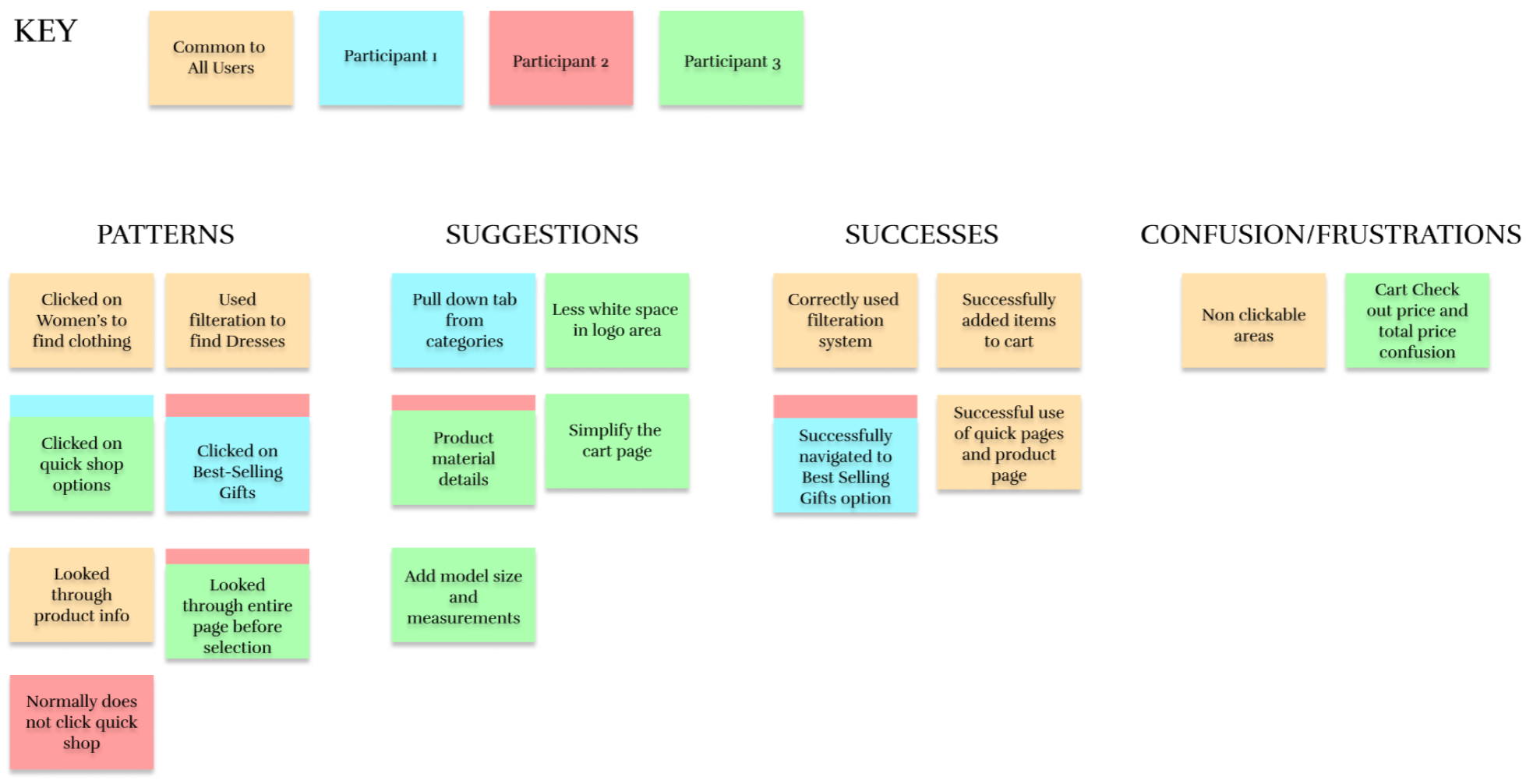
Affinity Map
